#architecture

by David Klemt David Klemt No Comments

BUNNYFiSH: A Lesson in Collaboration

BUNNYFiSH: A Lesson in Collaboration

by David Klemt
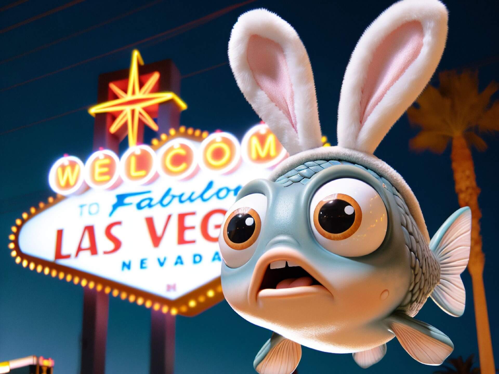
A cartoon fish wearing bunny ears, hovering near the world-famous "Welcome to Las Vegas" sign

Honestly, I’ve seen stranger things than a floating fish wearing bunny ears while living in Las Vegas.

Architect Craig Sean Palacios, co-founder of BUNNYFiSH studio in Las Vegas, told a compelling story about professional relationships during HD Expo 2024.

Palacios and his business partner worked closely with former Zappos CEO Tony Hsieh for a decade. Titled “Meaningful Collaboration: A Decade with Tony Hsieh,” the presentation was an interesting look into a unique client relationship.

When BUNNYFiSH studio first started, Palacios and Wichmann were working out of The Beat Coffeehouse. Interestingly, this space, located in Downtown Las Vegas, was an example of adaptive reuse architecture. The space was transformed from a quick-care medical center into a coffeehouse, with small exam rooms converted into small offices.

As Palacios recalls, he was wrapping up for the day about 14 years ago when someone popped their head into the BUNNYFiSH office. This person asked what Palacios was doing, and he answered that he was leaving for the day. Clarifying their question, the person inquired about BUNNYFiSH.

After explaining the studio’s overview and sharing some project details, Palacios was told the person would be back. Well, that person did return, and he had a few more people in tow. One of these people, as I’m sure you’ve guessed, was Hsieh.

Eventually, the group traveled from The Beat to the streets of Downtown Las Vegas, and through the doors of Hsieh’s apartment. Along with people milling about was a wall loaded with Post-It Notes. Written on these notes were words like “speakeasy” and “restaurant.” As an architect, Palacios instinctively began arranging the notes to create logical, cohesive concepts.

From there, Hsieh led Palacios to an empty lot, and asked what the architect would put there. Palacios saw a grocery store. Hsieh, a butterfly farm.

It was in that moment, said Palacios, that he began to understand Hsieh. After what was essentially an entire day with Hsieh, BUNNYFiSH studio, the Zappos CEO, and his team would go on to discuss architecture for several months.

Speaking the Same Language

During at least one conversation, Hsieh made the statement that he didn’t “speak architect.” And to this day, Palacios isn’t quite sure if that was a completely truthful claim.

However, he was told that no architect had ever really been able to make Hsieh happy up to that point. So, it appears that the two had found an effective method of communication, and Hsieh appeared happy to work with BUNNYFiSH studio.

That method did take time to develop, of course. Take, for instance, the transformation of a building in Downtown Las Vegas that Hsieh had acquired. When Palacios asked what Hsieh wanted, the latter told the former to “go to the W in Austin.”

That was the whole of the instruction.

So, with that as the entire brief, BUNNYFiSH went to the W in Austin. And, as Palacios explained, they did basically everything one could have done at the hotel at that time. Upon their return to Las Vegas, Palacios made the call to simply let Hsieh find him at The Beat when he was ready.

Sure enough, that’s what happened a few days later. Basically, Hsieh wanted BUNNYFiSH to transform his building into the W in Austin, in a way. When Inspire first opened, I visited the speakeasywhich required biometric access, I believe via a retinal scanand I would later watch Hey, Bartender in the space’s theater/TED Talk area, hosted by Dushan Zaric, co-founder of Employees Only.

Making Things Happen

Hsieh would go on to work with BUNNYFiSH on more projects, large and small. In doing so, they would all transform the Downtown Las Vegas landscape and culture.

To provide one large-scale example, BUNNYFiSH took on the Gold Spike’s metamorphosis from old-school, outdated casino to nightlife, social, and event space. This is another concept with which I’m familiar, having hosted an event there with the Bar & Restaurant Expo team when the event was still known as Nightclub & Bar.

There was also a small downtown motel conversion. Since “nobody needs parking in Las Vegas,” the parking lot was ripped out and a six-hole putt-putt course was installed. Of course, it wasn’t that simple; each hole was a version of a world-famous counterpart.

Anyone who has spent time in Downtown Las Vegas will be familiar with another BUNNYFiSH-Hsieh collaboration: Container Park. However, it’s a dog park project that really encapsulates the real message within Palacios’ story.

Per the Las Vegas native, Hsieh was a part of most of the meetings between his team and BUNNYFiSH. From time to time, he’d pop his head into a meeting with a question or idea, but that was about it.

Well, during one meeting, Hsieh popped up and asked if it was possible to build the world’s largest functional fire hydrant. By now several years into the relationship, Palacios knew the answer: “Yes.”

As he explained, he had learned to not say no to Hsieh. That may paint the entrepreneur in a tyrannical light. That isn’t, however, what Palacios meant.

Asking Why

While some clients can accept hearing “no” after they’ve asked a question, others need more. They require a why.

Sure, that’s sometimes because a client is, to put it diplomatically, “particular.” But as Palacios learned over the course of a decade-long collaborative relationship with Hsieh, sometimes “why” is a tool.

That three-letter question can spark creativity. Creativity in getting around but not running afoul of building codes, creativity in material or site selection, creativity in bringing an idea into the physical world.

While “no” is, indeed, a complete sentence, in the context of developing a restaurant, bar, hotel, etc., it can be a project killer.

Further, once one side of a business relationship comes to understand how the other interprets a why, communication grows stronger. Instead of just a conversation-halting “no,” collaborators learn to anticipate. So, that “no” starts out as a, “No, we can’t/shouldn’t do it that way, here’s why, here’s our solution.”

That’s a far stronger and healthier way to communicate and work together.

Real-world Example

Let’s look at a BUNNYFiSH project in Reno, Nevada. Traditionally, a guest room has a desk. And, traditionally, you’d be told by a hotel executive that the desk is so guests can write letters.

Well…which guests are actually doing this? Why are hotels still putting the same desk designs in their rooms?

Those two questions led to a room design featuring a reinvented desk. The BUNNYFiSH desk design is now the standard for the hotel group.

However, that desk design update pales in comparison to another change Palacios suggested.

Why, Palacios asked, did this hotel need a conference space? And why not transform the space that would traditionally be a conference space into…a bocce bar. A very large bocce bar, at that.

As Palacios explained the moment he posed those questions to hotel executives (a.k.a. major BUNNYFiSH clients), he was first met with silence. But that silence eventually turned to belief in Palacios and BUNNYFiSH, and there is in fact a bocce bar where one would expect a conference space.

According to Palacios, the bar is generating more revenue than the client projected they’d see from the conference area.

Takeaways

Too many people forget that “relationship” is the operative word in “business relationship.”

Had BUNNYFiSH seen their burgeoning relationship with Hsieh as solely transactional, they would likely have been relegated to the same pile of architects that hadn’t managed to satisfy Hsieh.

However, all parties developed an understanding of one another. They learned how to communicate with one another, and the results were incredible.

Further, Palacios and BUNNYFiSH learned to adapt that communication style for future clients, again to wonderful results.

Hospitality is a people business. As some people like to say, most problems are people problems. Going further, people problems are often communication problems.

Learning how to communicate and collaborate can solve a multitude of problems, and help develop long-term relationships.

Image: Shutterstock. Disclaimer: This image was generated by an Artificial Intelligence (AI) system.
Motel Hotel Resort Boutique Concept Development

by David Klemt David Klemt No Comments

Creative Conversion: Adaptive Reuse

Creative Conversion: Adaptive Reuse Architecture

by David Klemt

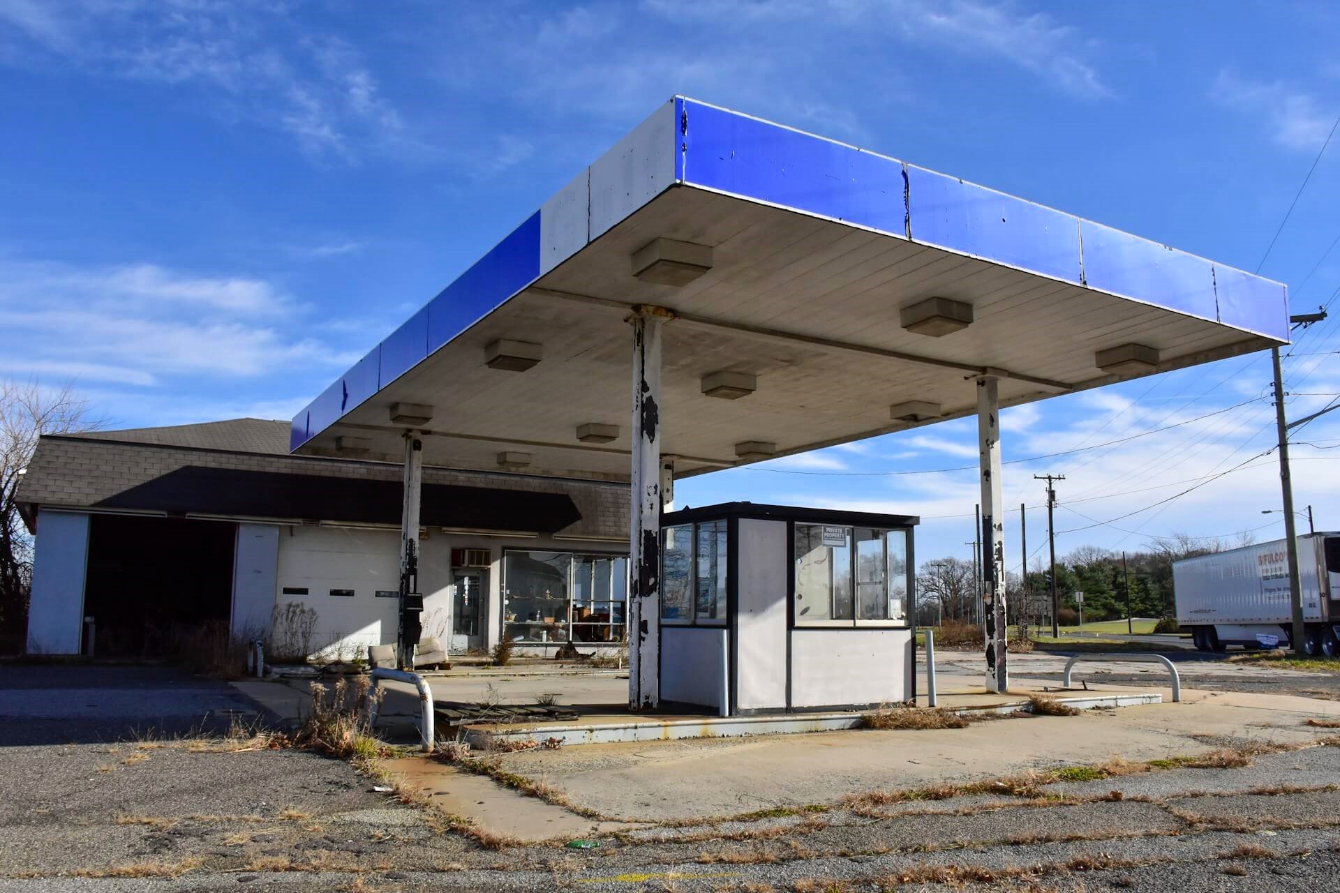
Abandoned gas and service station

Just taking a quick glance, I see covered outdoor seating, a cool front desk, and roll-up doors for an indoor-outside space.

There are several benefits to reusing an existing space and converting it into a bar or restaurant, including sustainability, and reenergizing a community.

This approach to design is called “adaptive reuse architecture.” A design layperson would likely call it “repurposing.”

As the term implies, this design methodology focuses on using an existing building in a new, modern way. It’s a beneficial approach to design and architecture in large part because new construction is so resource heavy.

Proponents of adaptive reuse architecture point to a given project’s lower carbon footprint, energy conservation, sustainability, and lower construction costs. However, there’s more to it than just reduced costs (attractive to owners and investors) and lower impact on the environment.

There are buildings that lie dormant across the US, Canada, and other countries that hold special places in communities’ hearts. Revitalizing these spaces can do wonders for lifting people’s spirits, preserving heritage while developing culture and community in a new way.

Finally, in my eyes, it’s honorable to allow a space to once again serve the community, albeit in a different way. A space that once provided a crucial service to an area—employment, resources, a communal space, shelter—can now serve as a place to nourish the body and mind through food, drink, and social interaction.

When considering a site (which should also be accompanied by a feasibility study), operators should look at locations that can help them do what neighborhood restaurants and bars have historically done best: serve as cornerstones for their communities.

Vinsetta Garage

One of the most popular approaches to reusing spaces for restaurants is repurposing service stations.

Maybe its American nostalgia, maybe it’s America’s love for the open road. Or, maybe it’s that there are so many service stations in disrepair throughout the country.

Of course, when considering a former gas station, service station, or automotive repair shop, one must consider the costs of making the space food- and people-safe. After all, oil, fuel, and other harmful substances were present in significant amounts over the years. That said, abatement is absolutely feasible as long as a realistic budget is in place.

At any rate, one great example of service station reuse is Vinsetta Garage. This concept in particular keeps a landmark alive: the restaurant lives inside the oldest garage east of the Mississippi. The garage survived for more than 90 years before closing its doors.

Of particular note is the team behind Vinsetta Garage, Union Joints. Reuse appears to be Union Joints’ raison d’être. Along with this garage, the group has reused a fire hall, a church, and a lumber mill. They’ve even repurposed a Hooters. (We can argue whether second- or third-generation restaurant spaces are adaptive reuse some other time.)

To my knowledge, Union Joints has never repeated a concept, owing greatly to their dedication to giving landmark buildings new life.


View this post on Instagram


A post shared by Vinsetta Garage (@vinsettagarage)

The Jane

What a transformation this space has undergone.

Once a military hospital chapel, The Jane counts among its accolades two Michelin Stars, multiple appearances on the World’s 50 Best Restaurants list, and was described as the world’s most beautiful restaurant at the 2015 Restaurants & Bar Design Awards.

The kitchen resides where the altar once stood, and themes of good and evil, and life and death, can be found throughout the space. This is truly a high-concept reuse of a space.


View this post on Instagram


A post shared by The Jane Antwerp (@thejaneantwerp)

Hoogan et Beaufort

When people consider adaptive reuse, many likely think of repurposing factories.

They’re normally large, and often feature impressive floor-to-ceiling heights. And, unfortunately, they can be found abandoned or otherwise unused all over many countries.

Reusing such a space can revitalize an area, removing an eyesore from a community and making it functional once again. An upscale example of a reused and reimagined factory is Hoogan et Beaufort, a restaurant in Montréal, Québec, Canada.

For nearly 100 years, the factory produced rail cars. The industrial space, with 28-foot-high ceilings, ceased production in 1992. Its doors were reopened by Chef Marc-André Jetté as a 70-seat restaurant in 2015.

HopSin Brewpub

This space is part of the Mag8 Craft Beer brewery in Colares, Portugal.

Formerly a tram station and post office, the building also houses HopSin, a brewpub.

As you can see in the post below, the flat roof of the building provides a fantastic outdoor area. Interestingly and conveniently, the tram that currently travels to Sintra stops right in front of HopSin.


View this post on Instagram


A post shared by HopSin Colares (@hopsin_colares)

Trinity Place

Located in New York City, Trinity Place reuses a bank vault. However, it’s not just any bank vault.

Diners have the opportunity to grab a bite and drink in a vault tied to industrialist and philanthropist Andrew Carnegie.

In partnership with New York Realty Bank, Carnegie commissioned the bank vault at the turn of the 20th century. And 120 years ago, it was said to be “the largest and strongest bank vault in the world.” It was so big that the building, the Trinity and US Realty Building, was built around and atop the vault in 1907.

Other than restoring it to use as an actual bank vault, what could one really do with this space? Well, two creative restaurateurs, Katie Connolly and Jason O’Brian restored the vault…and turned it into a bar and restaurantcomplete with a 40-foot mahogany barin 2006.

The Ordinary

Speaking of bank vaults, there’s a kitchen behind bank vault doors inside The Ordinary.

The team behind FIG, a James Beard Award-winning restaurant operating in Charleston, South Carolina. Also in Charleston, The Ordinary reuses a bank space.

The bank itself has quite a history. Interestingly, considering the focus of this article, the former bank stands on ground that was once a factory. However, that building was not reused; it was torn down to make way for Peoples-First National Bank, which opened for business in 1928.

Looking at that year, some of you may know what happened next. The Great Depression descended upon the world, and Peoples-First survived as best it could until closing its doors in 1933. Occupied for a time by a bakery, the building became Citizens & Southern National Bank in the 1940s, and operated as such for nearly 50 years.

Citizens & Southern National Bank became NationsBank at the start of the Nineties. Then, just before the turn of the century, the space transformed into a Bank of America branch. The bank closed in 2006.

In 2006, FIG’s owners bought the bank, reusing the space as best they could to reimagine and reopen it as a restaurant. The vault was, unfortunately, removed, but other elements of the former bank remain.


View this post on Instagram


A post shared by The Ordinary (@eattheordinary)

Image: Jason Mitrione on Unsplash

KRG Hospitality site development. Site selection. Restaurant. Bar. Cafe. Lounge. Hotel. Resort.

by David Klemt David Klemt No Comments

Datassential Identifies Top Design Trends

Datassential Identifies Top Design Trends

by David Klemt

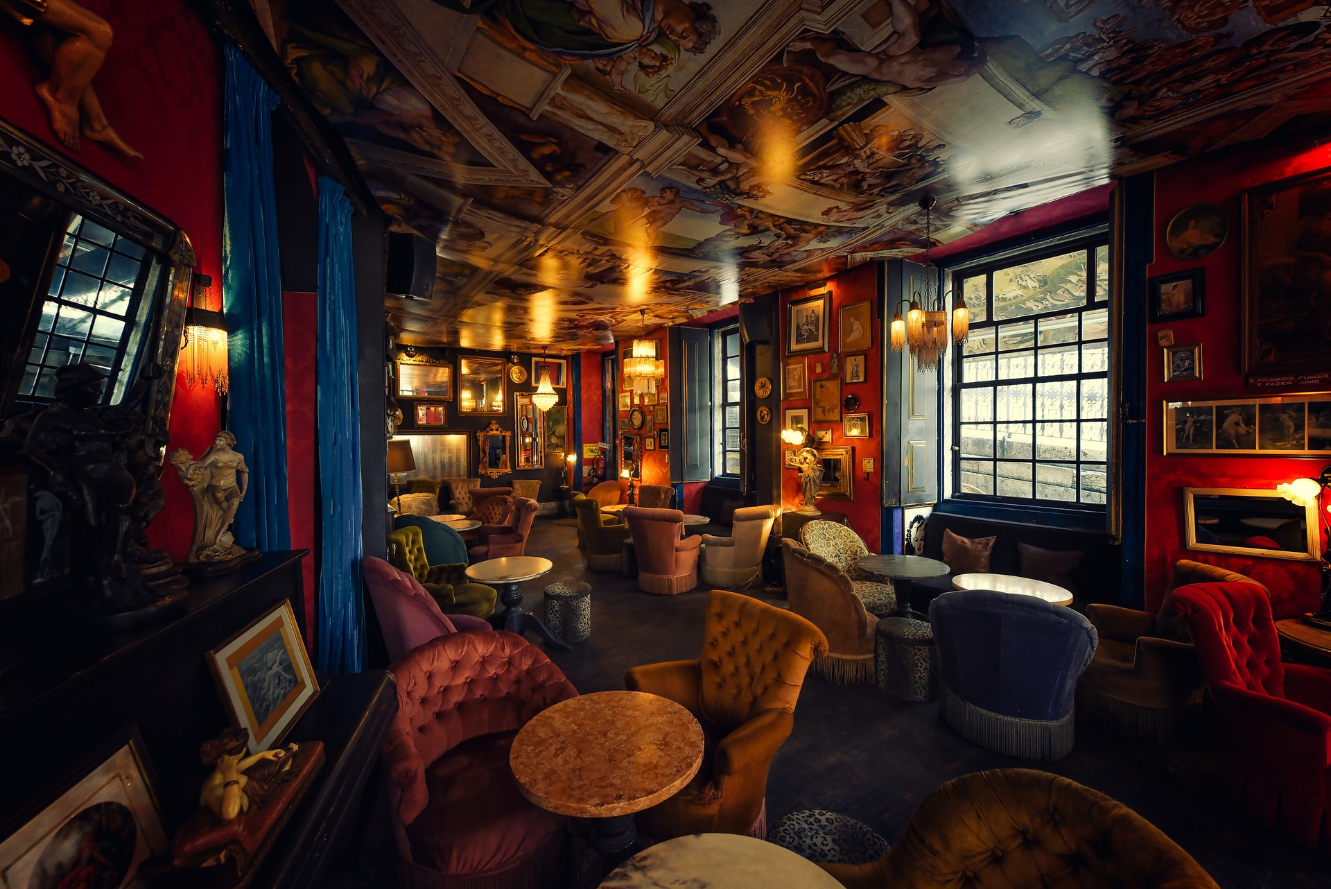
Maximalist interior bar or restaurant design

For their latest FoodBytes research topic, Datassential tackles some of the top restaurant design trends.

Click here to download Datassential’s “Foodbytes: Restaurant Design Trends” report. If you haven’t already, you’ll need to sign up for FoodBytes reports.

As the title states, this Datassential resource addresses the state of restaurant design. Now, we recommend reading the report for yourself but below you’ll find the points that really stand out to us.

If you’re among the 22 percent of operators that Datassential says are either considering a dining room redesign or have completed one, this report is particularly relevant to you.

Back-0f-house Design

Unsurprisingly, most people envision the interior dining area when considering restaurant design. However, as Lauren Charbonneau of Reitano Design Group says in Datassential’s latest FoodBytes, “Restaurants are living spaces that need to be agile.”

That means considering the entire space, not just the front of house. There’s also this stat from Datassential: 64 percent of operators think shrinking their footprint would be detrimental. If that’s the case, making the BoH smaller rather than the front may be the way forward.

So, let’s take a look at what Charbonneau identifies as BoH design trends to consider.

Clearly, it’s crucial operators consider their back-of-house teams. Providing a better workplace experience and improving efficiency can be done through design. Per Charbonneau, operators can use clever design and equipment choices to reduce steps, movement, labor, footprint, and costs.

Additionally, sustainability is not only crucial to responsible operation, being sustainable can reduce costs. Selecting Energy Star, Water Sense, and multi-functional equipment can make tasks easier for BoH teams, make a business more sustainable, and, again, drive down costs.

Maximalist Design

Finally, it seems, the minimalist design trend is losing its stranglehold on restaurant design. Of course, if that approach and design language works for a particular concept, it works.

However, maximalism is growing in popularity. For this type of design, think lots of color and bold patterns. Then, think about using multiple patterns and textures, including on the floors.

So, wallpaper, artwork, plush seating, loud tiles… Per Datassential, maximalism appeals to younger guests. In part, this is because these spaces can offer so many Instagrammable moments.

Monochrome Design

Okay, before we begin, “monochrome” doesn’t only mean a black-and-white palette. While that can work very well depending on the concept, monochrome also means using different tones of a single color.

Of course, there are multiple ways to approach this design trend. For example, if one does want to select a black-and-white scheme, Matte Black Coffee in Los Angeles is compelling.

Not only is the design monochrome, guests feel as though they’re inside a two-dimensional image. Per Datassential, this type of design is growing in popularity across the US specifically.

In terms of colorful monochrome, a great example is NYC’s Pietro Nolita. Not only have they chosen pink for their palette, it’s a core element of their branding: Pink AF.

Yet another way to approach this trend is for operators to use varying tones of particular colors to delineate different spaces. So, the dining room may be tones of pink while the bar is green and a private dining room is blue.

Nostalgic Design

As we’re all well aware, the pandemic derailed people’s plans. In particular, people hit the pause or cancel button on travel and vacations. Now, people appear to restarting their travel plans and getting back out there.

However, we’re also dealing with inflation. So, many people are holding off on spending money on travel. This is where restaurant design comes into play.

According to Datassential, “nostalgic escape” is a trend to watch moving forward. While very specific, this trend combines a dive into the past and capturing vacation vibes.

Per their FoodBytes report, Datassential identifies the following elements as key to this design approach:

  • Soft shades of colors. In particular, pink.
  • Tropical designs.
  • Fifties, Eighties, and Nineties design elements.

One concept that leverages this trend and did so before the pandemic is the Hampton Social. Currently, there are eight locations and two more are on the way.

Of course, it’s imperative that operators commit only to design language that’s authentic to their concepts. Pursuing a trend simply to pursue it is a clear path to disaster. That said, these design trends have massive appeal and can work for many operators and their brands.

Image: Davide Castaldo on Unsplash

Top