Nostalgia

by David Klemt David Klemt No Comments

Want to Leverage Nostalgia? Spin It

Want to Leverage Nostalgia? Put Your Spin on It

by David Klemt
A recent report from Campbell’s Foodservicealong with supporting data from external sources—supports what many operators assume about food trends.

Our dive into Campbell’s Culinary TrendPulse 2024 report is here for those who want to take a look. Anyone who wants to download a copy of the report for themselves can click here.

However, I’m referencing a fresh, quick-hit report from Campbell’s. While it only takes a handful of minutes to read, it’s chock-full of useful insights.

In particular, this latest menu trend analysis looks into succeeding with nostalgia. Citing a study from Symrise in their post, 70 to 76 percent of guests ages 22 to 65 cherish nostalgic items.

Put simply, that translates to a truth most operators know: guests of all ages like comfort foods. This really doesn’t need much explanation. Comfort foods areinsert shocked Pikachu face herecomforting. And I think we’re all seeking comfort these days.

So, yes, operators shouldin an authentic mannerspeak to and fill this guest desire. Authentically in this context means putting comfort foods on the menu that make sense. Doing this successfully requires menu programming that fits with the brand and within the venue’s theme. It also necessitates really knowing your guests and what they expect.

For example, will a particular restaurant’s guests find mac and cheese comforting? Will they stop scanning the menu when they come across pozole? What about cacio e pepe or beef braciole? How receptive will they be to sukiyaki?

A sharp operator should know their guests’ tastes better than just about anyone. Therefore, they should know what foods they’ll find comforting.

However, there’s another way to succeed with nostalgia and enhance the guest experience.

“New” Nostalgia

There are a couple of ways to interpret the term “new nostalgia.”

One way is to tap into what foods, generally speaking since they’re not monoliths, different generations view as comfort foods. This can be something as simple as a certain candy or beverage from their childhood.

Another way is for an operator and their kitchen team to take a nostalgic dish and put their own spin on it. Using candy as an example again, a scratch-made interpretation of a treat to create a dessert may work.

Consider, as a real-world model for this approach, the Chocotini that Oceans Resort Casino featured toward the end of August in 2022. This was a direct response to the news that Klondike had retired the Choco Taco, a nostalgic treat for millions of people spanning multiple generations.

Of course, operators can also cross-utilize items to craft new menu items that tap into the craving for nostalgic comfort foods. These dishes can be permanent additions, seasonal menu updates, or LTOs.

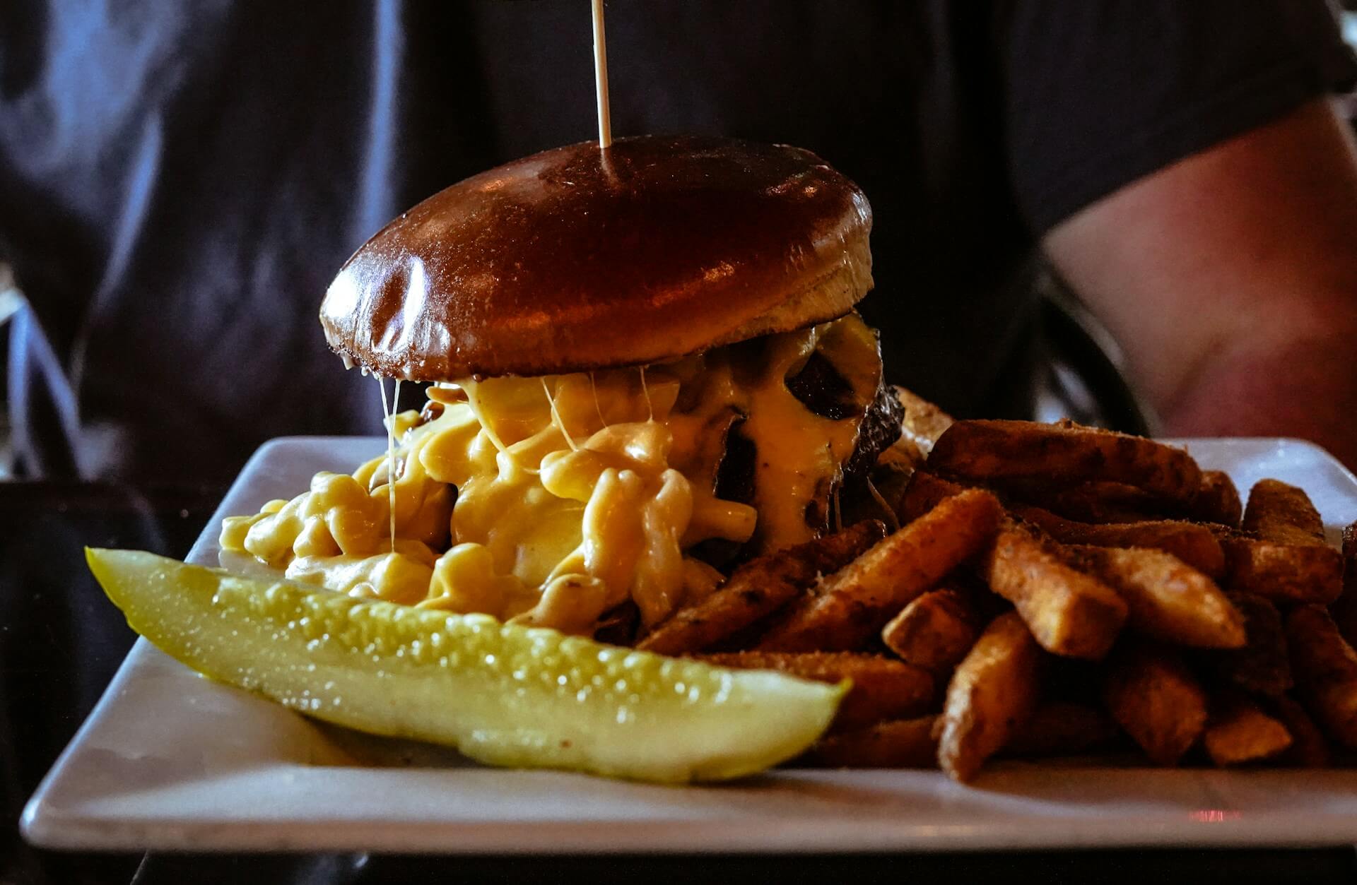
Take a look at the image atop this article. Mac and cheese is a classic comfort dish. Now, feature it as a topping for a signature burger. That’s a prime example of new nostalgia.

Going farther, kitchen teams can combine nostalgia with another trend to get even more creative: global flavors. Are there tacos on the menu? Maybe bulgogi tacos featuring beef short rib, Korean slaw, and soy-lime dressing would resonate with guests.

I’m not saying anyone should menu these specific items. Rather, my aim here is to get operators and their kitchen and bar teams to put their heads together and create undeniable, irresistible takes on classics.

The key, again, is an understanding of the market, community, and guests. From there, it’s about getting creative and crafting dishes that guests can’t get anywhere else.

Image: Alex Haney on Unsplash
KRG Hospitality menu development. Restaurant. Bar. Cafe. Lounge. Hotel. Resort. Food. Drinks.

by David Klemt David Klemt No Comments

Datassential Identifies Top Design Trends

Datassential Identifies Top Design Trends

by David Klemt

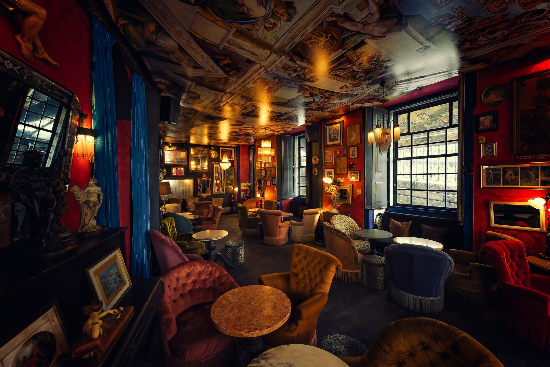
Maximalist interior bar or restaurant design

For their latest FoodBytes research topic, Datassential tackles some of the top restaurant design trends.

Click here to download Datassential’s “Foodbytes: Restaurant Design Trends” report. If you haven’t already, you’ll need to sign up for FoodBytes reports.

As the title states, this Datassential resource addresses the state of restaurant design. Now, we recommend reading the report for yourself but below you’ll find the points that really stand out to us.

If you’re among the 22 percent of operators that Datassential says are either considering a dining room redesign or have completed one, this report is particularly relevant to you.

Back-0f-house Design

Unsurprisingly, most people envision the interior dining area when considering restaurant design. However, as Lauren Charbonneau of Reitano Design Group says in Datassential’s latest FoodBytes, “Restaurants are living spaces that need to be agile.”

That means considering the entire space, not just the front of house. There’s also this stat from Datassential: 64 percent of operators think shrinking their footprint would be detrimental. If that’s the case, making the BoH smaller rather than the front may be the way forward.

So, let’s take a look at what Charbonneau identifies as BoH design trends to consider.

Clearly, it’s crucial operators consider their back-of-house teams. Providing a better workplace experience and improving efficiency can be done through design. Per Charbonneau, operators can use clever design and equipment choices to reduce steps, movement, labor, footprint, and costs.

Additionally, sustainability is not only crucial to responsible operation, being sustainable can reduce costs. Selecting Energy Star, Water Sense, and multi-functional equipment can make tasks easier for BoH teams, make a business more sustainable, and, again, drive down costs.

Maximalist Design

Finally, it seems, the minimalist design trend is losing its stranglehold on restaurant design. Of course, if that approach and design language works for a particular concept, it works.

However, maximalism is growing in popularity. For this type of design, think lots of color and bold patterns. Then, think about using multiple patterns and textures, including on the floors.

So, wallpaper, artwork, plush seating, loud tiles… Per Datassential, maximalism appeals to younger guests. In part, this is because these spaces can offer so many Instagrammable moments.

Monochrome Design

Okay, before we begin, “monochrome” doesn’t only mean a black-and-white palette. While that can work very well depending on the concept, monochrome also means using different tones of a single color.

Of course, there are multiple ways to approach this design trend. For example, if one does want to select a black-and-white scheme, Matte Black Coffee in Los Angeles is compelling.

Not only is the design monochrome, guests feel as though they’re inside a two-dimensional image. Per Datassential, this type of design is growing in popularity across the US specifically.

In terms of colorful monochrome, a great example is NYC’s Pietro Nolita. Not only have they chosen pink for their palette, it’s a core element of their branding: Pink AF.

Yet another way to approach this trend is for operators to use varying tones of particular colors to delineate different spaces. So, the dining room may be tones of pink while the bar is green and a private dining room is blue.

Nostalgic Design

As we’re all well aware, the pandemic derailed people’s plans. In particular, people hit the pause or cancel button on travel and vacations. Now, people appear to restarting their travel plans and getting back out there.

However, we’re also dealing with inflation. So, many people are holding off on spending money on travel. This is where restaurant design comes into play.

According to Datassential, “nostalgic escape” is a trend to watch moving forward. While very specific, this trend combines a dive into the past and capturing vacation vibes.

Per their FoodBytes report, Datassential identifies the following elements as key to this design approach:

  • Soft shades of colors. In particular, pink.
  • Tropical designs.
  • Fifties, Eighties, and Nineties design elements.

One concept that leverages this trend and did so before the pandemic is the Hampton Social. Currently, there are eight locations and two more are on the way.

Of course, it’s imperative that operators commit only to design language that’s authentic to their concepts. Pursuing a trend simply to pursue it is a clear path to disaster. That said, these design trends have massive appeal and can work for many operators and their brands.

Image: Davide Castaldo on Unsplash

by David Klemt David Klemt No Comments

Serve Up a Slice of Nostalgia: Viennetta Returns

Have a Slice of Nostalgia: The Return of Viennetta

by David Klemt

A British confection launched in the ’80s is headed back to the United States.

Wall’s brought what’s considered by some the first-ever branded ice cream dessert—Viennetta—to the world almost 40 years ago. The British frozen dessert and ice cream producer, owned by Unilever, launched the legendary treat in 1982.

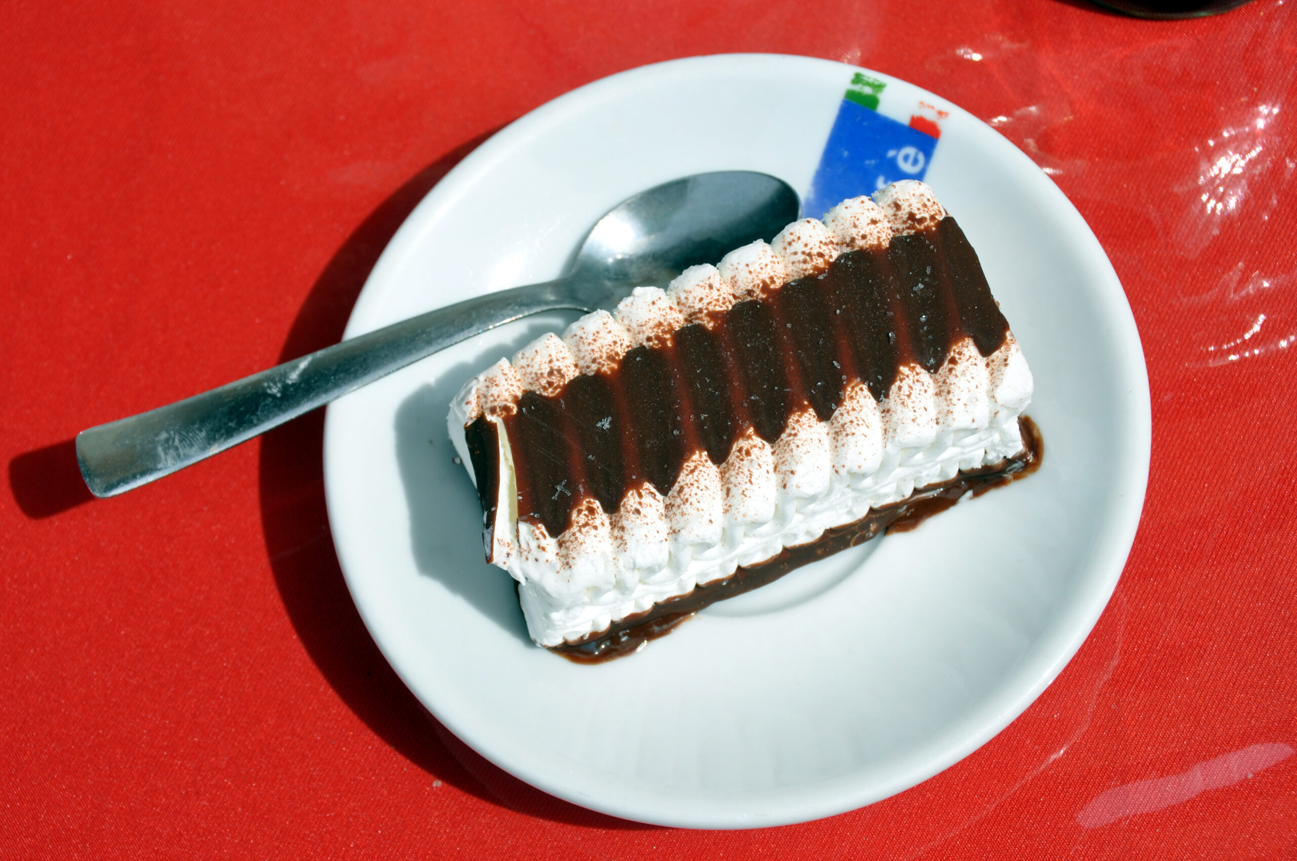
Viennetta is said to be based on a multi-layered pastry known as mille-feuille. The original Wall’s product consists of layers of vanilla ice cream and compound chocolate that create the dessert’s signature wavy top.

Viennetta ice cream dessert

While Viennetta was a product of Wall’s in Europe, it came to America under Unilever’s Breyers label. At one point in the ’90s, the product disappeared from the United States, though it maintained a presence throughout Europe, Australia, New Zealand, and elsewhere.

As an ’80s kid, I remember seeing Viennetta commercials late in the decade,  or perhaps I saw them in the early ’90s. Either way, the images of what passed for elegance and sophistication back then informed me that Viennetta must be a “fancy” dessert. I mean, c’mon—it was served on a silver platter!

Alas, I never had the opportunity to taste what I could only assume back then was an opulent dessert before it was so cruelly whisked out of the country. But that will change this year.

Unilever is bringing at least the original vanilla flavor back to the States in 2021 under their Good Humor brand. Back in the ’80s, Viennetta wasn’t available solely at supermarkets—it was also sold at KFCs and Pizza Huts. I’ve found no announcements from Unilever or Good Humor that Viennetta will be available through a partnership at any restaurants this year, but it would make sense.

Can you experience nostalgia if you’ve never actually owned, enjoyed or consumed a product in the past personally? Apparently the answer is yes, because when I saw Viennetta was returning to America my first thought was, “Finally—I’ll have my chance,” followed by a flood of images from my childhood and early teen years.

Should I be ashamed? Maybe. But I’m not. And I know I’m not alone. And I know something else: Operators looking to leverage nostalgia, particularly if they’re ’80s- or ’90s-themed or feature programming around those decades, should be excited about this news.

Image: Wikimedia Commons

Top