Menu design

by David Klemt David Klemt No Comments

Balancing Menu Creativity with Preferences

Menu Design: Balancing Creativity and Guest Preferences

by Nathen Dubé

An AI-generated image of a chef-owner and head chef reviewing a restaurant menu

Note: AI-generated image.

A menu is not just a list of dishes; it’s a strategic tool that influences guest choices, enhances the dining experience, and maximizes sales.

Therefore, a well-designed menu is a crucial component of a restaurant’s success.

Come along with me and we’ll explore the principles of effective menu design, balancing creativity with guest preferences, and the role of menu psychology in driving decisions.

Key Principles of Effective Menu Design

Layout and Structure

The foundation of a great menu lies in its layout and structure. Organizing menu items logically—grouping appetizers, mains, desserts, and beverages into distinct sections—guides guests through their dining journey.

This structure helps in creating a seamless experience where guests can find what they are looking for easily. Subsections like “vegetarian,” “seafood,” or “grilled” can further refine the selection process.

Logical organization not only aids in navigation but also enhances the overall dining experience by reducing decision fatigue.

Item Placement

Item placement on the menu can have a significant impact on what guests decide to order.

The “Golden Triangle” concept suggests that guests’ eyes typically first gravitate to the center, then the top right, and finally, the top left of the menu. Placing high-margin items in these areas can drive sales.

Additionally, highlighting signature dishes and specials in these prime spots can make them more appealing. Strategic placement is essential for maximizing the visibility of certain items, encouraging guests to order the dishes that are most profitable or unique.

Readability

A menu should be easy to read and visually appealing. Choosing appropriate fonts and sizes ensures that the text is legible in various lighting conditions.

A key factor to bear in mind is maintaining clear spacing between items to prevent the menu from looking cluttered and overwhelming.

Ensuring the clarity and ease of reading is vital; if a guest struggles to read the menu, it detracts from their dining experience. Effective readability involves the thoughtful selection of fonts, sizes, and spacing to create a harmonious and inviting look.

Balancing Creativity and Guest Preferences

Creative Culinary Expression

A menu is an opportunity to showcase the chef’s creativity and culinary expertise. Innovative dishes that use unique ingredients or cooking techniques can set a restaurant apart from its competitors.

Creativity is crucial for developing a distinctive culinary identity, and offering guests an exciting and memorable dining experience.

However, it’s important to balance creativity with dishes that guests are familiar with and enjoy. Balancing innovation with tradition ensures that while the menu offers new and novel experiences, it also provides comfort and familiarity.

Popular Guest Preferences

To appeal to a broad audience, a menu should include a mix of creative dishes and popular favorites. Including familiar dishes alongside innovative options can cater to a wider audience, making everyone feel welcomed and valued.

Additionally, considering dietary restrictions and preferences is crucial. Offering vegetarian, vegan, gluten-free, and allergen-friendly options ensures that all guests can find something they love. Addressing dietary needs and preferences not only broadens the guest base but also demonstrates the restaurant’s commitment to inclusivity and guest satisfaction.

Market Trends

Staying updated with current culinary trends helps keep the menu fresh and exciting.

For instance, trends such as plant-based diets, sustainability, and ethnic fusion can attract trend-conscious diners. Incorporating these trends into the menu shows that the restaurant is contemporary and aware of its guests’ evolving tastes.

Aligning the menu with market trends can create a buzz and draw attention to the restaurant, enhancing its reputation as a forward-thinking and dynamic establishment.

The Role of Menu Psychology

Influencing Guest Choices

Menu psychology involves using strategic design and phrasing to influence what guests order.

Some effective techniques include strategic pricing methods like decoy pricing. This approach involves placing a high-priced item next to a mid-priced item to make the latter seem more reasonable. Another tactic is charm pricing, an approach that uses prices that end in “.99” to make them appear more attractive.

These subtle cues can guide guest decisions and encourage them to choose certain dishes. Understanding menu psychology allows restaurants to steer guests subtly towards higher-margin items without being overtly pushy.

Maximizing Sales

Highlighting profitable dishes with visual cues, such as boxes, borders, or bold text, can draw attention to these items. Descriptive language that evokes the senses can make dishes sound more appealing, and entice guests to try them.

For example, describing a dish as “succulent, slow-roasted pork with a caramelized apple glaze” creates a vivid image, and stimulates appetite.

Effective use of menu psychology can boost sales significantly, and enhance the dining experience by making the menu more engaging and enticing.

Enhancing Appeal with Descriptive Language and Visuals

Descriptive Language

Using evocative and sensory words to describe dishes can enhance their appeal. Highlighting unique ingredients, preparation methods, and the origin of the dish creates a story that resonates with guests.

Descriptive language adds depth and dimension to the menu, transforming it from a simple list of dishes into a narrative that engages the guest’s imagination. Phrases like “handcrafted,” “locally sourced,” and “artisanal” add a touch of sophistication and quality, making dishes sound more attractive and special.

Visuals

Including high-quality images or illustrations of key dishes can boost their appeal significantly. Visuals help guests imagine the dish, and can trigger an emotional response

A well-designed menu with complementary color schemes and design elements reinforces the restaurant’s theme, and creates a cohesive brand identity.

The use of appealing visuals can stimulate appetite, and make the decision-making process more enjoyable for guests, enhancing their overall dining experience.

Examples of Innovative Menus

Case Studies of Successful Menus

Analyzing menus from renowned restaurants provides valuable insights into successful design choices.

For instance, The French Laundry in California uses a minimalist menu design that emphasizes simplicity and elegance, allowing the focus to remain on the high-quality ingredients and sophisticated dishes.

Similarly, Nobu’s menu balances innovative Japanese-Peruvian fusion dishes with classic favorites, catering to a diverse clientele.

These examples illustrate how thoughtful menu design can enhance the dining experience, and create a distinctive brand identity.

Insights from Industry Experts

Menu design professionals and restaurateurs offer valuable best practices. Experts suggest evaluating and adapting the menu continuously to meet changing guest preferences and market trends.

Updating the menu regularly not only keeps it interesting for repeat guests but also allows for the introduction of seasonal ingredients and new culinary innovations.

Industry insights highlight the importance of flexibility and responsiveness in menu design, ensuring that the restaurant remains relevant and competitive.

Conclusion

A thoughtfully designed menu is a powerful tool in the restaurant industry. It balances creativity with guest preferences, uses psychology to influence choices, and enhances appeal through descriptive language and visuals.

Investing in effective menu design can enhance the dining experience, drive guest satisfaction, and boost sales. For restaurateurs, it’s an essential aspect of creating a successful and memorable dining establishment.

By understanding and implementing these principles, restaurant owners can craft menus that not only reflect their culinary vision but also resonate with their target audience, ensuring a winning formula for success.

A well-designed menu can transform the dining experience, making it more engaging, enjoyable, and, ultimately, profitable for the restaurant.

Image: Microsoft Designer

KRG Hospitality Contact Request for Proposal 30 Minute Discovery Session

Book Below to Setup a 30-Minute Complimentary Discovery Call and Request for Proposal.

by David Klemt David Klemt No Comments

Eliminate Hesitation: Streamline Your Menu

Eliminate Hesitation: Streamline Your Menu

by David Klemt

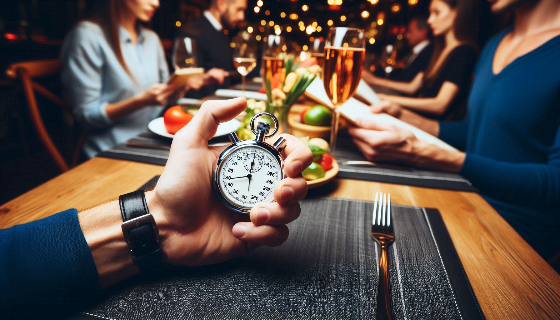
An AI-generated image of a person holding a stopwatch at a restaurant table while guests read the menu

That’s an interesting stopwatch layout. Also, we don’t recommend sitting with guests and timing them as they review your menu.

Operators should develop an understanding of the concept of the paradox of choice to understand how American guests make menu item selections.

So, allow me a crash course in this psychological concept. There are two prevailing components to the paradox of choice. One is that the more options one has, the less satisfaction they’ll feel upon making a choice. The other is that when presented with an overwhelming number of choices, also known as “choice overload,” people often just fall back to their usual choice rather than trying something new.

A quick note: The paradox of choice isn’t the same as the fallacy of choice. That concept relates to presenting someone with limited, extreme choices to drive them to ignore all of the other choices they could consider and select.

Understanding the paradox of choice will help an operator tackle a key task: streamlining their menus.

A survey from US Foods earlier this year contains quite a few intriguing revelations. Among their findings, one stands head and shoulders above the rest, at least to me: Almost 80 percent of Americans find deciding what they want to order at a restaurant difficult. Further, one factor outpaces all others when it comes to difficulty choosing.

Hence, my explanation of the paradox of choice at the top of this article.

Menus are too Big

There are two key factors making it difficult for Americans to choose what to order at a restaurant. Nearly a quarter of respondents23 percentindicate that they’re simply picky people. Alright, fair enough.

But the main factor, unsurprisingly, is that restaurants are presenting guests with too many options. That’s according to 54 percent of survey respondents. Quick math tells me that’s more than double the picky eaters.

Another 15 percent of US Foods survey respondents, however, say they have no trouble deciding what they want to order. Eight percent say they’re indifferent, which is an entirely different problem. A guest who’s indifferent to the restaurant and menu isn’t an engaged guest, and that’s not going to inspire loyalty and repeat visits.

Of course, no operator can please everyone, and some people aren’t going to be blown away no matter how good the food, drinks, and service can be.

So, does this mean that Americans are indecisive, facing paralysis whenever a servers asks for their order? Well…maybe. We have a lot going on, and “overwhelmed” would describe many of my fellow Americans right now.

However, the real culprit is menu size. In trying to please and retain guests, some operators are loathe to shrink their menus.

Most KRG clients can attest to the following: the president of our agency, Doug Radkey, prefers a smaller, streamlined menu. In fact, he prefers menus not pass the 25-item mark. Given his druthers, Radkey favors 12 to 15 items.

There are several reasons for this preference. Chief among these are controlling and reducing labor and food costs. (Radkey prefers to control costs rather than cut them, realistically.) Other reasons are less strain on the back of house, easier cross-utilization of ingredients, consistency, and reduced ticket times.

We can also add improving guest satisfaction to the list. On average, an American restaurant guest takes nine minutes to decide what they want to order at a restaurant. Streamline and shrink the menu, and this number should fall, while satisfaction rises.

Anyone should see that a smaller, sharper menu represents wins across the board.

AI image generator: Microsoft Designer

KRG Hospitality Start-Up Restaurant Bar Hotel Consulting Consultant Solutions Plans Services

by David Klemt David Klemt No Comments

Chef Duffy x NRA Show: Live Menu Read

Chef Duffy x NRA Show: Live Menu Read

by David Klemt

Graffiti of crossed chef's knives underneath a baseball cap that reads, "D.E.G."

Chef Brian Duffy crushed it in Chicago at the 2024 National Restaurant Association Show.

We’re sharing tips from Chef Brian Duffy‘s live menu reads at this year’s National Restaurant Association Show in Chicago.

These informative sessions are always standouts at industry trade shows and conferences. Both the operator who submits their menu anonymously and the audience gain valuable insight into menu programming and development.

In ten minutes or less, the Chef Duffy shares wisdom that’ll boost guest engagement; streamline and energize the kitchen; and help save on labor and food costs. And he won’t even Bar Rescue anyone who submits a menu. That is to say, no, he doesn’t yell at anyone while giving them tips for fixing their menu.

As Chef Duffy pointed out during his latest live menu reads, an operator’s menu has the potential to create generational wealth. However, it must be programmed properly for it to reach that potential.

So, ask yourself a question right now about your menu: Would you be proud for your menu, in its current state, to be plastered across a billboard? If not, I have another question for you: Why aren’t you taking the time to rectify that situation?

Your menu is your concept’s billboard. Treat it as such.

Oh, and one note for the NRA Show before we dive in: These sessions deserve at least two hours. One hour just isn’t enough given how impactful Chef Duffy’s live menu reads are for operators.

Menu Programming 101

There’s a logical reason why Chef Duffy is never short on menus to review. In fact, he addressed the situation directly at the 2024 NRA Show.

“Everybody has the same shit on their menu,” he stated frankly.

One explanation for why menus seem so similar makes a lot of sense.

“We’ve been told what to put on our menu buy our purveyors,” said Chef Duffy during his live menu read.

For the most part, operators are given the same product catalogs. These are circulated nationally, not regionally. So, everyone is ordering the same items. Clearly, Chef Duffy is fed up with this situation.

“We’re not here to do the same things that everyone else is,” declared Chef Duffy. “I don’t want to see that anymore.”

Menu #1: Sports Bar

This first menu featured a vibrant design that instilled a sense of patriotism. Chef Duffy theorized that he’d feel good spending time in this space, based on the menu’s appearance.

However, he wasn’t a fan of the layout of the menu. Taking up valuable real estate was a large catering ad, placed directly in the center.

In the top left were salads. “‘Add chicken to any salad,'” read Chef Duffy. “No shit. Why are we stopping at chicken? We can add anything to a salad.”

Based on his knowledge of food costs and the menu’s pricing, Chef Duffy deduced that the operator’s food costs were too high. In fact, he estimated that food costs were more than 31 percent. The burgers, he surmised, were running a 35-percent cost.

By the way, Chef Duffy always puts two slices of cheese on his burgers to fill the top out more. This delivers a more visually appealing experience, and a better bite.

On the topic of pricing, operators must maintain balance. For example, this first menu priced the addition of two slices of bacon at $3.50, but a chicken breast was six dollars. Two Chicago hotdogs cost more than a burger.

Menu #2: Breakfast Spot

Unfortunately, the operator committed one of Chef Duffy’s deadliest menu sins. There was a photo of the restaurant’s steak and eggs.

Worse, the image showed a rather large steak paired with a commodity egg. If this dish doesn’t leave the kitchen looking exactly like the picture, guests are going to be underwhelmed and unimpressed. Further, why are operators still trying to save money by buying commodity eggs?

However, there was a second deadly menu sin committed by the operator. Given the overall perception this menu delivered, the claim that at least one dish featured “wild-caught crab” didn’t ring true to Chef Duffy.

I’m confident in saying that I think lying on a menu may provoke Chef Duffy’s wrath more than a photo.

“If you lie to me on your menu, I will tear you apart,” he stated quite strongly.

That said, he did like the menu’s design (minus the photos). Even better, he recognized that there were several inventive spins on breakfast classics. Remember, “We’re not here to do the same things that everyone else is.”

Menu #3: Sports Bar

To be honest, I was expecting this type of menu. In fact, I thought it would be the first menu design encountered during this session.

Essentially, it was a collection of what everyone else has on their menus.

As an example, there were wings on the menu, and the sauces were anything but creative. Chef Duffy didn’t address it but they were also listed without commas, so they appeared to be one long, run-on sentence of a sauce.

The most glaring issues, however, were the pasta and the dessert. Both sections contained just a single item. That’s rightthere was an entire section dedicated to one pasta dish. Moreover, it’s not like there were a number of modifiers one could select to personalize their pasta.

This was the item description underneath the dessert section (designated as “Closers”): “Dessert of the week – $8 Please ask your server for details.” There’s a significant issue with that description and placement, as identified by Chef Duffy.

If a menu includes desserts, the guest is likely going to forget about them after they’ve ordered their starter and entree. It’s far more effective to have a dessert tray or cart and train your servers to suggest dessert when they touch the table toward the end of the meal.

Takeaways

Chef Duffy throws in more tips during a single menu read than most people would expect.

Below are some of the takeaways that make his live menu reads so insightful:

  • Only list name brands if they come from a local farm. This approach shows that an operator cares about supporting local producers and is part of the community.
  • Use the best ingredients for the specific concept.
  • If a restaurant features housemade buns for burgers and/or bread for sandwiches, they should offer a version as an appetizer. Really make this idea shine by also offering housemade specialty butters.
  • Operators that have chips on their menus should use the crumbles and “dust” to make breading for other items. After all, the chips have been paid for alreadyuse all of them.
  • It’s better and more impactful to have 25 items on a menu that are executed perfectly than 50 items that are executed poorly.
  • Chef Duffy doesn’t agree with omitting prices from menus. “Why? Are we negotiating? Are we negotiating before I place my order?”

Connect with Chef Duffy on Instagram, and learn more about him on the Duffified Experience Group website.

Image: Shutterstock. Disclaimer: This image was generated by an Artificial Intelligence (AI) system.

KRG Hospitality Start-Up Restaurant Bar Hotel Consulting Consultant Solutions Plans Services

by David Klemt David Klemt No Comments

Real-world Menu Tips from Chef Brian Duffy

Real-world Menu Tips from Chef Brian Duffy

by David Klemt

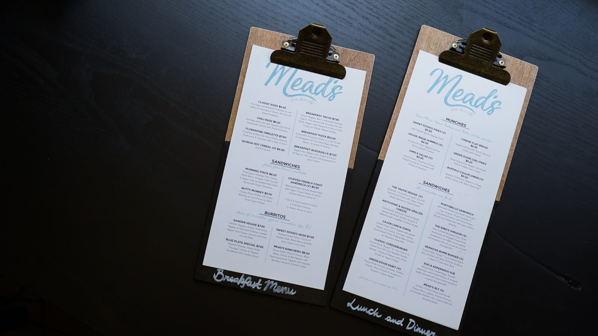
Two restaurant food menus

I wonder what Chef Duffy would say about these menus.

Call it an education session, call it a workshop, one of the best features of the Bar & Restaurant Expo is live menu feedback from Chef Brian Duffy.

This is certainly true of the 2023 Bar & Restaurant Expo. During this year’s BRE (formerly Nightclub & Bar Show, or NCB), Chef Duffy delivered well over two hours of real-world menu feedback.

To be sure, BRE educational programming is always beneficial. Attendees who take the time to plan their schedules to include education sessions will take invaluable tips back to their businesses.

However, watching in real time as Chef Duffy critiques real menus submitted by BRE attendees provides insight that will impact the guest experience and success of a restaurant or bar immediately.

When delivering his feedback, Chef Duffy is unacquainted with the menus. He’s also unfiltered. So, attendees of these sessions are provided a window to Chef Duffy’s professional opinions, on the fly, in real time.

Take, for example, this blunt statement: “If you serve tilapia in your restaurant, you suck.” Before anyone has a conniption, Chef Duffy is referring to unethically farm-raised tilapia that’s often exposed to waste.

Technical Difficulties

Due to unforeseen AV issues, Chef Duffy was unable to use the large screens in the room to review menus for 30 to 40 minutes.

Now, some speakers may be shaken when encountering such a technical difficulty. This isn’t the case for Chef Duffy. In fact, all in attendance from the start of his session were lucky enough to gain insights beyond menu design because of the AV issues.

First, we all gained some insight into Chef Duffy’s consulting process. When engaged for restaurant consultation, he watches an evening service. Next day, he’s in your kitchen at 10:00 AM. What he sees in your kitchen tells him what’s happening throughout your restaurant. By the way, if he encounters just two spelling errors on your menu, he’s done reviewing it—you need a fresh start.

Second, inventory. Chef Duffy assumes you keep eleven percent of your overall revenue on your shelves. So, if you’re generating $100,000 each month, your shelves hold $11,000 of product. When reviewing your financial situation, take a look at that number for your own restaurant or bar.

Third, executive chefs versus head chefs. Chef Duffy has been on the ground for more than 100 restaurant openings. He has interviewed countless chefs. Have you ever wondered about the difference between an executive chef and a head chef? Knowledge of the financial aspects of running a kitchen. Without it, someone’s not an executive chef—they’re a head chef. Executive chefs know (and in theory can be trusted with) finances; head chefs make sure the brigade comes to work on time.

Finally, a cost-reduction tip. When you speak with your food reps, ask about DWO items: “Discontinued When Out.” You may be able to get your hands on some great items for a fraction of the cost.

Pricing Tips

Since we’ve looked at costs, let’s take a look at pricing.

Determining pricing effectively involves more than just gathering intel about your competitors. Chef Duffy suggests looking over your entire menu and committing to a pricing hard deck.

For example, “I’ll never sell a starter for less than X dollars.” You commit to never selling a entree for lower than a certain dollar amount. If you breach that promise, you may damage your brand.

Staying on the topic of pricing, don’t take advantage of your guests. Chef Duffy absolutely believes you can charge premium prices—but only for innovation. How do you know if a menu item is innovative? If it has made its way to major chain restaurants and you’re not doing anything unique to your version, it’s not innovative.

In terms of layout and design, don’t “lead” guests to prices with dots, dashes, or solid lines. Just place the price next to the item and move on.

Menu Tips

Another crucial tip that really should go without saying but, well, here we are, is proofreading. Want to make sure your menu is correct in a fun way? Throw a proofreading party. Invite ten of your VIP guests, gather your staff, invite some friends and family if you won’t be distracted, and ask for honest feedback.

Of course, you can elevate this event by serving new menu items tapas or family style to your VIPs. Brand-new restaurant yet to open? I suggest having the proofreading party with staff, friends, and family.

Keep in mind that menu real estate is valuable. Does a section of your menu come with identical accompaniments? Explain that at the top of section rather than including them in every. single. item. separately. Yes, this happened during the live 2023 BRE reads.

Chef Duffy would like you to stop putting specials on your menu. Again, menu real estate is valuable. If you can spare the room for specials, are they really special? Instead, your servers should know the day’s specials and share them with your guests from memory. And speaking of memory, upselling really only works if your staff knows the menu backward and forward.

Oh, and Chef Duffy would love it if you’d stop doing truffle fries if you’re not going to use premium products.

Your Menu Isn’t “Just” a Menu

Obviously, I haven’t shared every one of Chef Duffy’s menu tips. However, the above should serve as more than enough to motivate you to review your own menu with a critical eye.

In fact, you should be inspired to have your leadership, BoH, and FoH teams review the menu as well.

Yes, spelling matters. Yes, grammar matters. And yes, every detail and bit of menu real estate matters. This is because, simply put, your menu is more than a list of items for sale.

As Chef Duffy says, “Your menu is your calling card, it’s just that simple.” He would also tell you that the first place people encounter your business is online after a search. So, your website is your showcase. But your menu? That’s your billboard on the freeway, as he says.

QR codes may have been the standard from 2020 to 2022. We all know why. But for the most part, with the exception of QSRs and LSRs, people want to hold your menu. It’s a tactile experience and true engagement.

Menu design, like your website’s design, matters. Don’t believe me? I have two framed menus on my office wall, and they’re not from client concepts.

To learn more about Chef Brian Duffy, visit his website here. And, of course, make sure to follow him on Instagram. To listen to his Bar Hacks podcast episodes, click here for episode 33 and here for episode 53.

Image: Catherine Heath on Unsplash

KRG Hospitality Complete Bar Menu Audit

Top