Foodservice

by David Klemt David Klemt No Comments

SBA Releases 46% of Held RRF Funds

SBA Releases 46% of Held RRF Funds

by David Klemt

Single one-hundred-dollar bill

After receiving pressure from members of Congress and scrutiny from the industry and media, the SBA has released some RRF funds.

This comes after several months of inaction from the Small Business Administration.

The amount released on Wednesday, November 23 isn’t insignificant. However, the SBA disbursed less than half of the RRF money they’re sitting on.

Still, the news is welcome, particularly to the RRF applicants who finally received a grant.

$180 Million in RRF Funds

Several months ago, the Government Accountability Office (GAO) investigated the handling of the Restaurant Revitalization Fund. Back in July, the fruits of that investigation came to light: $180 million of the $28.6 billion in RRF funding had not been disbursed.

Further, it was reported in back August that the SBA was partnering with the Department of Justice to “formulate a plan on how to distribute” the money.

Now, nearing the end of November, it appears the SBA and DoJ have finalized a plan. Two days ago, on the eve of Thanksgiving, the SBA released $83 million of the $180 million that was discovered in July of this year. If every applicant received the same amount, that works out to $491,124 per grant.

With any hope, this means the remaining $97 million will go to deserving grant applicants very soon.

Where did the Money Go?

We don’t yet know which RRF grant recipients received a portion of the $83 million released this week.

What we do know is:

  • 169 applicants received this week’s grants;
  • applicants were selected by the order in which they applied for grants in 2021;
  • each recipient was alerted about their grant award this week;
  • the recipients are expected to actually receive the money some time next week;
  • grant recipients have until March 2023 to spend the funds; and
  • the recipients won’t have to repay the money if they spend it on “approved purchases.”

It’s logical that the disbursement of the $97 million in remaining RRF grants will follow the same procedure.

Statements on this Week’s Developments

This week, both the Small Business Administration and National Restaurant Association made statements about the release of $83 million in RRF funds.

“This week, the U.S. Small Business Administration (SBA) began distribution of returned funding in the Restaurant Revitalization Fund (RRF) program, following the program’s closure in June 2021. In doing so, the SBA worked with the advice of the Department of Justice on a plan to distribute the remaining funds, approximately $83 million,” reads a press release from the SBA.

“In addition to other SBA assistance programs, the RRF has helped more than 100,000 restaurants and other food and beverage business owners survive the pandemic,” continues the administration’s statement.

Sean Kennedy, executive vice president of public affairs for the NRA, said the following about this week’s disbursement:

“The SBA’s action represents the final chapter of our nearly three-year effort to secure dedicated federal pandemic relief dollars for local restaurants. Today’s announcement is great news for those 169 operators fortunate enough to receive an RRF grant, but hundreds of thousands more are struggling with uncertainty.

“We must continue to look forward because the enormous challenges of the industry will continue beyond today. From the recruitment of employees to the constantly rising costs for food, running a restaurant right now is a daily struggle. There are steps the government can take to support restaurants in every community, and we will continue to press for solutions at the federal, state, and local level.”

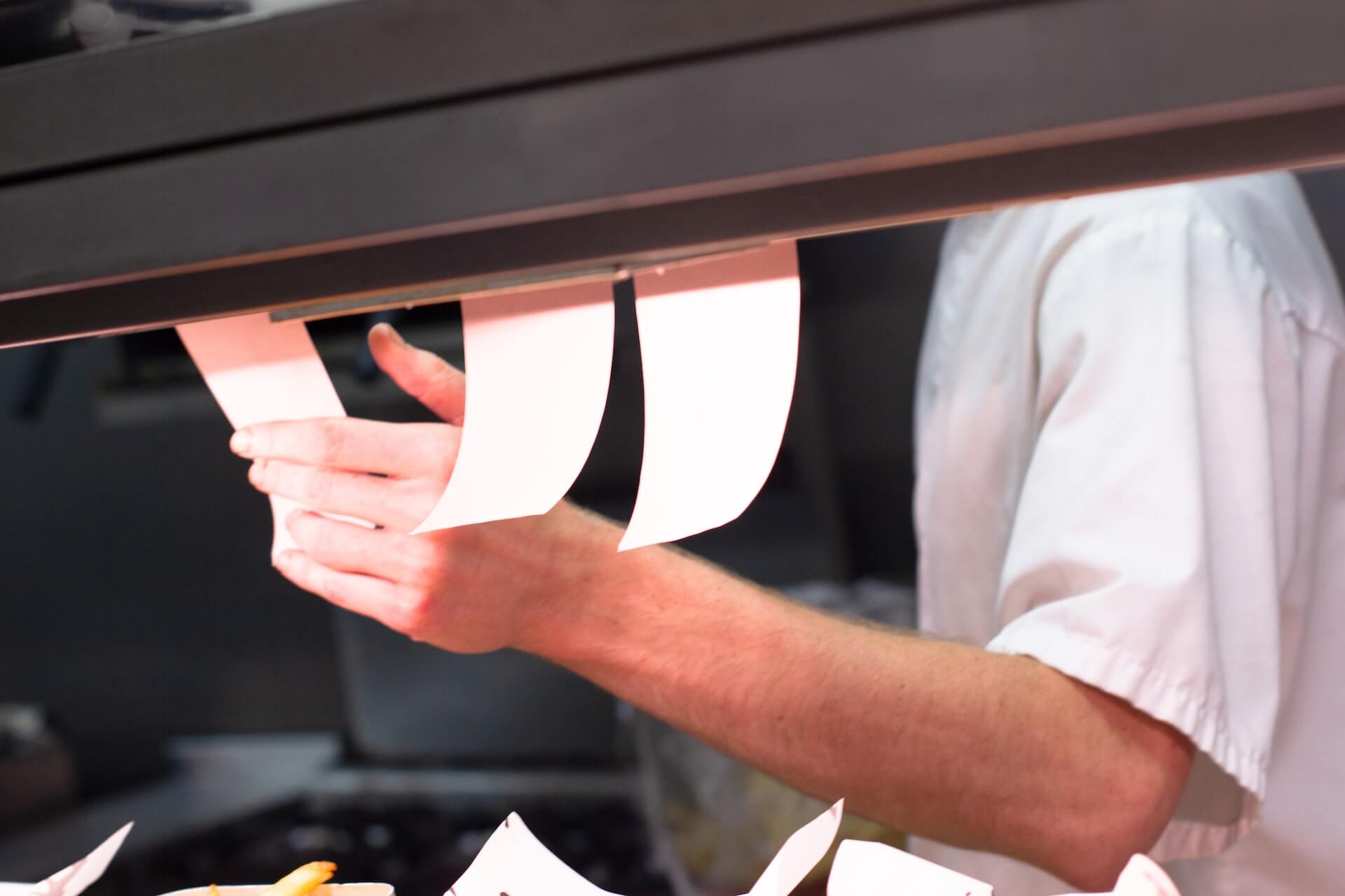
Image: AR on Unsplash

by David Klemt David Klemt No Comments

Traffic Up but Margins Thinner

Traffic Up but Margins Thinner

by David Klemt

Chef checking tickets

The One Table 2022 report from Datassential focuses on the state of the operator and what the industry can expect moving forward.

This informative report shares survey results from 801 operators across America. While some of the findings are positive, it’s clear many operators are enduring significant challenges.

For some, traffic and sales are up. However, that’s not the situation others find themselves in.

To download and review the Datassential One Table 2022, please click here.

The Respondents

For this report, Datassential shares the survey answers from 801 respondents.

Most survey respondents are independent operators. In fact, they account for 71 percent of the participants. Making up the rest of the field are chain operators (15 percent) and franchise operators (14 percent).

As far as segment types, the majority of survey participants operate in the fast-casual space (18 percent). Unsurprisingly, fine dining is the smallest group of respondents at six percent. Thirteen percent operate midscale restaurants, and 12 percent are at the helm of casual-dining concepts. Somewhat surprisingly, just ten percent of participants operate QSRs.

Interestingly, the service format is fairly even among survey participants. Fifty-three percent of operators are full-service and 47 percent are limited-service.

Similarly, survey respondents represent the country’s regions pretty evenly:

  • South: 30 percent
  • Midwest: 29 percent
  • Northeast: 21 percent
  • West: 20 percent

In terms of market type, most respondents operate in the suburbs (49 percent). Following somewhat closely are urban-market operators, at 31 percent. Just 20 percent of survey participants operate in rural markets.

Traffic, Sales and Margins

At first glance, Datassential’s survey reveals positive news.

Now, I’m sure people find the terms “pandemic, “pre-pandemic,” and “post-pandemic” exhausting at this point. However, there’s no denying we continue to feel the aftershocks sent through the industry by the pandemic.

So, how do things look now in comparison to pre-pandemic traffic and sales levels?

First, the positives. Nearly half of survey respondents—47 percent—say their traffic is up in comparison to where it was pre-pandemic. Add to that the 14 percent who say their traffic is the same and 61 percent of operators appear to be in good shape.

In terms of sales, 51 percent of survey participants have good news. That news is that their sales are higher in comparison to pre-pandemic levels. Again, add the 14 percent who don’t see any change. So, that’s 65 percent of operators who appear to be performing well.

But with the good there’s bad. Unfortunately, 39 percent of respondents report lower traffic than pre-pandemic levels. And sales are lower than they were before the pandemic for 35 percent of survey participants.

Operator margins are lower for all respondents. Generally speaking, the profit margin for operators before the pandemic sat at 21 percent. Now, the average is 13 percent. QSRs and fast-casual restaurants are a bit higher among survey respondents: 17 percent and 15 percent, respectively.

On paper things do look up for many operators. However, the industry is still suffering, with a third struggling to rise to even pre-pandemic levels of traffic and sales.

Image: Daniel Bradley on Unsplash

by David Klemt David Klemt No Comments

The Most-stressed Cities in the US

These are the Most-stressed Cities in the US

by David Klemt

Deflated smiley face balloon in street

There’s a simple argument to be made that one characteristic the happiest cities share is being among the least stressful to live.

Yesterday we took a look at the happiest cities in the US, according to WalletHub analysis. Click here in case you haven’t yet read that article.

Today, let’s check out the most- and least-stressed cities in America. As with their happiest and least-happy cities list, WalletHub ranks 182 cities based on stress levels.

Of course, “least stressed” doesn’t mean “stress-free.” Nor should it—some stress is good for us. After all, stress can push us to perform our best, bring out our problem-solving creativity, and even energize us.

The rankings below may surprise you. Like me, you may even find yourself raising an eyebrow and disagreeing with some of them.

However, it’s a compelling list worth reviewing if you’re an operator, leadership team member, hospitality professional, or in the site-selection portion of opening a restaurant or bar.

The Top 25 Cities of Stress

When determining their results, WalletHub ranked 182 cities according to four main categories. Those categories are: work stress; financial stress; family stress; and health and safety stress. The categories consist of 40 key metrics in total.

I think it’s safe to assume that no city wants to be in the top 25 of this list, or even the top 50. Neither, I’m certain, does any city want to wear the crown of “Most Stressed US City.”

Unfortunately, someone must be number one. Below, the top 25 “Cities of Stress,” per WalletHub:

  1. Cleveland, Ohio
  2. Detroit, Michigan
  3. Gulfport, Mississippi
  4. Baltimore, Maryland
  5. Philadelphia, Pennsylvania
  6. Memphis, Tennessee
  7. New Orleans, Louisiana
  8. Birmingham, Alabama
  9. Louis, Missouri
  10. Toledo, Ohio
  11. Augusta, Georgia
  12. Jackson, Mississippi
  13. North Las Vegas, Nevada
  14. San Bernadino, California
  15. Fayetteville, North Carolina
  16. Akron, Ohio
  17. Wilmington, Delaware
  18. Houston, Texas
  19. Montgomery, Alabama
  20. Shreveport, Louisiana
  21. Cincinnati, Ohio
  22. Newark, New Jersey
  23. Mobile, Alabama
  24. Columbus, Georgia
  25. Indianapolis, Indiana

Alas (I don’t get to use this word much), Ohio has four cities on this list. In fact, the Buckeye State has two cities in the top ten.

Of course, Ohio isn’t the only state with multiple cities in the top 25 stressed cities. Alabama has three cities among the top 25. Also, Mississippi and Louisiana each have two cities on this part of the list, unfortunately.

Cities 26 Through 91

As you’ll see below, Ohio shows up a couple of times in this portion of the list. However, so do a handful of other states.

For example, ten Texas cities land on this part of the list. That means Texas has 11 cities among the “top” half of the most-stressed US cities.

  1. Baton Rouge, Louisiana
  2. Las Vegas, Nevada
  3. Huntington, West Virginia
  4. Springfield, Missouri
  5. Dover, Delaware
  6. Norfolk, Virginia
  7. Milwaukee, Wisconsin
  8. Chicago, IL
  9. Newport News, Virginia
  10. Washington, DC
  11. Dallas, Texas
  12. Richmond, Virginia
  13. Tulsa, Oklahoma
  14. Chattanooga, Tennessee
  15. Bridgeport, Connecticut
  16. San Antonia, Texas
  17. Atlanta, Georgia
  18. Glendale, Arizona
  19. New York, New York
  20. Tucson, Arizona
  21. Columbia, South Carolina
  22. Columbus, Ohio
  23. Knoxville, Tennessee
  24. New Haven, Connecticut
  25. Brownsville, Texas
  26. Rochester, New York
  27. Casper, Wyoming
  28. Vancouver, Washington
  29. Oklahoma City, Oklahoma
  30. Jacksonville, Florida
  31. Corpus Christi, Texas
  32. Charleston, West Virginia
  33. Henderson, Nevada
  34. Phoenix, Arizona
  35. Modesto, California
  36. Wichita, Kansas
  37. Winston-Salem, North Carolina
  38. Little Rock, Arkansas
  39. Moreno Valley, California
  40. Louisville, Kentucky
  41. Stockton, California
  42. Spokane, Washington
  43. Fresno, California
  44. Miami, Florida
  45. Kansas City, Missouri
  46. El Paso, Texas
  47. Salem, Oregon
  48. Hialeah, Hawaii
  49. Los Angeles, California
  50. Fort Smith, Arizona
  51. Fort Worth, Texas
  52. Denver, Colorado
  53. Arlington, Texas
  54. Buffalo, New York
  55. Greensboro, North Carolina
  56. Bakersfield, California
  57. Fort Wayne, Indiana
  58. Providence, Rhode Island
  59. Tacoma, Washington
  60. Port St. Lucie, Florida
  61. Lewiston, Maine
  62. Laredo, Texas
  63. Cape Coral, Florida
  64. Grand Prairie, Texas
  65. Garland, Texas
  66. Aurora, Colorado

Cities 92 Through 137

This is where things begin to turn around, at least mathematically. This is the “bottom” half of the list.

Or, to phrase it another way, this section starts identifying the least-stressed cities in America.

  1. Portland, Oregon
  2. Ontario, California
  3. Lubbock, Texas
  4. Reno, Nevada
  5. Huntsville, Alabama
  6. Sacramento, California
  7. Amarillo, Texas
  8. Albuquerque, New Mexico
  9. Tampa, Florida
  10. Long Beach, California
  11. Colorado Springs, Colorado
  12. Fontana, California
  13. Tallahassee, Florida
  14. Las Cruces, New Mexico
  15. Worchester, Massachusetts
  16. Orlando, Florida
  17. West Valley City, Utah
  18. Fort Lauderdale, Florida
  19. Peoria, Arizona
  20. Riverside, California
  21. Mesa, Arizona
  22. Nashville, Tennessee
  23. Des Moines, Iowa
  24. Nampa, Idaho
  25. Tempe, Arizona
  26. Irving, Texas
  27. Oakland, California
  28. Grand Rapids, Michigan
  29. Charlotte, North Carolina
  30. Rancho Cucamonga, California
  31. Boston, Massachusetts
  32. Pittsburgh, Pennsylvania
  33. Honolulu, Hawaii
  34. Oceanside, California
  35. Pearl City, Hawaii
  36. Anchorage, Alaska
  37. Warwick, Rhode Island
  38. Virginia Beach, Virginia
  39. Cheyenne, Wyoming
  40. Petersburg, Florida
  41. Chesapeake, Virginia
  42. Billings, Montana
  43. Lexington-Fayette, Kentucky
  44. Durham, North Carolina
  45. Santa Ana, California
  46. Jersey City, New Jersey

Cities 138 through 182

Finally, we reach what cities, according to WalletHub analysis, experience the least amount of stress.

  1. Salt Lake City, Utah
  2. Aurora, Illinois
  3. Santa Clarita, California
  4. Glendale, California
  5. Manchester, New Hampshire
  6. Paul, Minnesota
  7. Garden Grove, California
  8. Pembroke Pines, Florida
  9. Yonkers, New York
  10. Chandler, Arizona
  11. Oxnard, California
  12. Juneau, Alaska
  13. Anaheim, California
  14. Santa Rosa, California
  15. Chula Vista, California
  16. Charleston, South Carolina
  17. Raleigh, North Carolina
  18. San Francisco, California
  19. Huntington Beach, California
  20. Omaha, Nebraska
  21. San Diego, California
  22. Gilbert, Arizona
  23. Scottsdale, Arizona
  24. Rapid City, South Dakota
  25. Austin, Texas
  26. Seattle, Washington
  27. Minneapolis, Minnesota
  28. Missoula, Montana
  29. Boise, Idaho
  30. Nashua, New Hampshire
  31. Plano, Texas
  32. Cedar Rapids, Iowa
  33. Lincoln, Nebraska
  34. Portland, Maine
  35. Irvine, California
  36. Burlington, Vermont
  37. Sioux Falls, South Dakota
  38. Bismarck, North Dakota
  39. San Jose, California
  40. Columbia, Maryland
  41. Fargo, North Dakota
  42. Overland Park, Kansas
  43. Madison, Wisconsin
  44. South Burlington, Vermont
  45. Fremont, California

Twelve of the cities on this part of the list are in California. Further, the least-stressed city in California: Fremont. If you read yesterday’s article, you know that WalletHub ranked Fremont, California, the happiest city in the US.

Image: Nathan Dumlao on Unsplash

by David Klemt David Klemt No Comments

Which Cities and States are the Happiest?

Which US Cities and States are the Happiest?

by David Klemt

Yellow smiley face ball

As an entrepreneur and operator evaluating a market for a first location or expansion, it can help to know where people are happiest.

Equally as helpful: Knowing the cities and states that are the least happy. Not, necessarily, so an operator can avoid these markets.

Rather, one’s concept may be a ray of stress-free sunshine for a given community. Providing a great workplace with a positive culture can work wonders for both the happiest and least-happy places. And as the cornerstones of the communities they serve, restaurants and bars can improve their guests’ quality of life.

We’ve looked at the US cities with the greatest inflow and outflow (which can reveal happiness levels), as identified by Redfin. And we’ve checked out the best US retirement cities, researched by Clever.

Now, we’re taking a look at which US cities and states are the happiest and least happy, according to WalletHub. In case you’re unaware, personal finance site WalletHub researches a vast array of topics. You can browse them here.

Happiest Cities

While determining which are happiest, WalletHub identified the happiest 182 cities. Obviously, that’s a far cry from how many cities are in the US.

According to one source, there 19,495 cities, towns, and villages across the country (per data from 2018). Of those, 4,727 cities have populations of 5,000 or more. A total of 310 cities have populations of at least 100,000, and only ten are home to one million people or more.

So, living in any of the 182 cities WalletHub suggests one is pretty happy. However, these are the ten happiest cities, in descending order:

  1. Fremont, California
  2. Columbia, Maryland
  3. San Francisco, California
  4. San Jose, California
  5. Irvine, California
  6. Madison, Wisconsin
  7. Seattle, Washington
  8. Overland Park, Kansas
  9. Huntington Beach, California
  10. San Diego, California

As you can see, six of the 10 cities are in California. In fact, 29 of the 182 cities on this list are located in the Golden State.

To create their list, WalletHub analyzed several metrics that make up three main categories: emotional and physical well-being; work environment; and community and environment.

Fremont, CA, is number one for emotional and physical well-being. The top spot for work environment goes to San Francisco, CA. And the number-one city for community and environment is Casper, Wyoming, which is number 79 on the list overall.

Least-happy Cities

Again, understanding that there are more than 19,400 cities, towns, and villages in the US alters the context of this list a bit.

Living and operating in one of these 182 cities indicates a person is living in a happy city. Basically, it isn’t the worst place to live if it’s on this list.

At any rate, let’s look at the 10 cities that make up the bottom of WalletHub’s list. Or, the “least-happy” cities, at least as far as these rankings are concerned.

  1. Detroit, Michigan
  2. Gulfport, Mississippi
  3. Memphis, Tennessee
  4. Huntington, West Virginia
  5. Montgomery, Alabama
  6. Cleveland, Ohio
  7. Augusta, Georgia
  8. Fort Smith, Arizona
  9. Mobile, Alabama
  10. Shreveport, Louisiana

Happiest States

WalletHub also ranked 50 states to determine the happiest and least happy. I checked, and, yep, that’s all of ’em! I will say it’s a bit disappointing they didn’t include Puerto Rico, but it isn’t the 51st state (yet).

WalletHub focused on 30 metrics to rank the states, which make up three main categories: emotional and physical well-being; work environment; and community and environment.

In descending order, the happiest states in America are:

  1. Hawaii
  2. Maryland
  3. Minnesota
  4. Utah
  5. New Jersey
  6. Idaho
  7. California
  8. Illinois
  9. Nebraska
  10. Connecticut

Hawaii doesn’t just take the top spot overall, it also claims number one for emotional and physical well-being. Utah takes first for work environment, and community and environment.

Rounding out the “happiest half” of the US are:

  1. Virginia
  2. South Dakota
  3. North Dakota
  4. Massachusetts
  5. New Hampshire
  6. Iowa
  7. Delaware
  8. Florida
  9. Georgia
  10. North Carolina
  11. Wisconsin
  12. Washington
  13. New York
  14. Maine
  15. Wyoming

Least-happy States

Conversely, the following are the least-happy states, starting with the unhappiest:

  1. West Virginia
  2. Louisiana
  3. Arkansas
  4. Kentucky
  5. Alabama
  6. Mississippi
  7. Oklahoma
  8. Tennessee
  9. New Mexico
  10. Missouri

Filling out the least-happy half of the country are:

  1. Alaska
  2. Michigan
  3. Ohio
  4. Indiana
  5. Texas
  6. Nevada
  7. Vermont
  8. South Carolina
  9. Kansas
  10. Arizona
  11. Colorado
  12. Montana
  13. Rhode Island
  14. Pennsylvania
  15. Oregon

In terms of the three metrics WalletHub analyzed, West Virginia is ranked last for emotional and physical well-being. Unfortunately, Mississippi is last for work environment. And Texas comes in last for community and environment.

Image: chaitanya pillala on Unsplash

by krghospitality krghospitality No Comments

2023: Year of the POS Systems?

2023: Year of the POS Systems?

by David Klemt

SpotOn POS system on laptop

Image from SpotOn press release

According to SpotOn, the industry could be in for a tech revolution next year as independent operators pursue more powerful POS solutions.

The results of a survey conducted by the cloud-based POS platform are rather revealing. In an effort to better understand where the industry is heading, SpotOn surveyed 300 independent and small-chain restaurant operators.

Both full-service and limited-service (LSR) concept operators participated in this SpotOn survey. Intended to identify the challenges operators face currently, the results reveal much more.

Below, the picture these survey results paint for the industry.

Legacy vs. Innovation

This isn’t the first time I’ve stated the following: Our industry hasn’t been the fastest to implement new technology.

However, we did appear to turn that around in 2021. Now, heading into 2023, our industry may be pursuing cutting-edge tech solutions even more fervently. Today’s guest expects more tech, and your team likely wants access to more modern tech that makes their jobs easier.

Per SpotOn’s survey, 81 percent of independent operators still use so-called “legacy” POS systems. These are “traditional” systems from companies that have been around for quite some time.

It’s not difficult to understand why the vast majority of independent operators continue using legacy systems:

  • Investing in a new platform requires expenditures of money and time.
  • Introducing a new POS platform requires staff training.
  • Staff need to grow adept at using the new system.
  • It can be daunting to research the available platforms and implementing change.

So, independent and small-chain operators have a choice to make: Stick with the familiar or invest in the future. Change can not only be intimidating, it can be expensive.

However, it seems that most operators are ready to throw comfort to the wayside and embrace innovation.

State-of-the-art Benefits

Should the SpotOn survey prove to be accurate snapshot of the industry, 75 percent of operators will implement new tech next year. According to SpotOn, this is largely in response to growing labor challenges, such as scheduling and retention.

The restaurant, bar, nightclub, and food truck platform found that operators are spending as much as 20 hours per week on administrative tasks. State-of-the-art POS systems can slash those hours by:

  • streamlining operations;
  • making scheduling simpler;
  • calculating tips and payout for payroll; and
  • managing overtime, an increasingly common task.

More modern POS platforms can automate labor management tasks, saving operators time, money, and frustration. Automation and streamlining give operators something invaluable: time.

In particular, innovative and helpful tech solutions provide an operator with time to focus on growing their business. When weighing whether to keep a familiar but less feature-rich POS system or invest in a modern platform that seamlessly integrates many solutions, ask yourself a couple important questions:

  • What’s my time worth?
  • What am I focusing on every day?
  • Am I growing my business or stagnating?
  • Is my current POS system helping or hindering my team?
  • Does my POS system streamline and automate any tasks?

Image: SpotOn

by David Klemt David Klemt No Comments

Tipping is on the Ballot in Washington, DC

Tipping is on the Ballot in Washington, DC

by David Klemt

Folded dollar bills

Out of concern that people who work for tips aren’t making minimum wage in Washington, DC, Initiative 82 is on the ballot.

This is interesting for several reasons. One of which is the fact this isn’t the first time this issue has been voted on in DC.

Back in 2018, Initiative 77 was presented to Washington, DC, voters. The initiative took the $3.33 per hour minimum wage for tipped workers up to $15 per hour, the full minimum wage.

In June 2018, the measure was approved by voters. However, the Washington, DC, Council held a vote and repealed Initiative 77 after if had been passed.

Phil Mendelson (D-Chairman) of the Washington, DC, Council, introduced the bill that ultimately repealed Initiative 77 in October 2018.

“The Council amends laws all the time. And if a law is a bad law it should be amended or repealed,” said Mendelson at the time. “It doesn’t matter if the law was adopted by Congress, the voters, or ourselves.”

Further, Mendelson claimed that tipped workers themselves—bartenders, servers, valets, manicurists, and more—didn’t hold a favorable view of the passing of the initiative.

“77 may be well-intentioned, but the very people the Initiative is intended to help are overwhelmingly opposed. If we want to help workers – protect them from harassment and exploitation – there are better ways than Initiative 77,” Mendelson said.

One council member, Mary Cheh (D-Ward 3), opposed repealing Initiative 77 and addressed claims that it was harmful to tipped workers.

“Although I take these claims seriously, in my view they are speculative and not borne out by the experience of the other jurisdictions that have one wage,” said Cheh.

Support

Whenever increasing tipped worker wages to full minimum wage comes up, we tend to encounter the same arguments for and against.

Currently, the tipped hourly wage in DC is $5.35 per hour. In comparison, full minimum wage in DC is $16.10 per hour.

Now, as the law reads, if a tipped worker’s wages don’t equate to full minimum wage, their employer is expected to bridge the gap.

The key argument for the passing of Initiative 82 is simple: tipped workers should make at least minimum wage. These workers deserve the stability of knowing how much they’ll make each shift and earning a living wage (consistently, hopefully).

Those who support Initiative 82 also say that since the measure doesn’t outlaw tipping, tipped workers would earn more than minimum wage.

Opposition

Opponents, however, argue that the initiative will harm tipped workers. Some say that operators will cut shifts and increase prices in response to Initiative 82 passing. This will, of course, lead to servers, bartenders, and other tipped workers making much less than they did in the past.

Traffic may also decrease because it’s assumed that operators will increase costs significantly.

There’s also the argument that’s often (if not always) made when this topic comes up: Tipped workers themselves don’t support these initiatives.

“I have not met a single server who wants this,” Washington, DC, bar owner David Perruzza told the Washington Blade. Perruzza added, “The people who support this don’t know anything about the service industry.”

A Few Questions…

I’ve made no secret of my cynicism when it comes to politicians and their relationships with our industry.

My main argument was made for me: the Restaurant Revitalization Fund saga. We watched for months as Congress failed to replenish the RRF, leaving more than 177,000 operators and their staffs to fend for themselves. This, after months of dangling replenishment in front of all of us. Ultimately, they abandoned us.

Tellingly, Senator Rand Paul (R-KY) referred to RRF replenishment as a “bailout.” And apparently he doesn’t think much of the challenges operators have faced since the start of the pandemic, asking, “Where’s the emergency?” The closures of tens of thousands of restaurants and bars, often the cornerstones of communities across the country, doesn’t rank as an emergency, apparently.

So, Initiative 77, Initiative 82, and similar measures beg a few questions:

  • Do politicians actually ask their tipped-wage constituents their thoughts on this topic before introducing these ballot measures?
  • When these initiatives are being considered, do people just ask a few operator friends their opinions?
  • Do local, state, and federal politicians really have a grasp of our industry?

One thing is certain: Industry eyes across the country are on Initiative 82. If it passes, we can likely expect similar measures to be introduced in cities and states. Should it fail, it may be a while before another jurisdiction sees this type of initiative again.

Image: Annie Spratt on Unsplash

by David Klemt David Klemt No Comments

Menus in Canada: Who Wants What Items?

Menus in Canada: Who Wants What Items?

by David Klemt

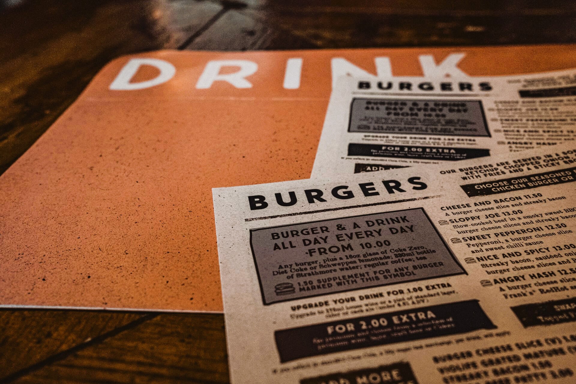
Bar and restaurant food and drink menus

Nobody has a crystal ball telling them what they should put on their menus to boost traffic and revenue, but we do have data.

In this instance, we have useful data regarding Canadian consumers specifically. Not only do we have helpful information from Restaurants Canada, David Henkes from Technomic has also weighed in. For those who are unfamiliar, Technomic is one of the best foodservice research and consulting firms.

Before we dive into Restaurant Canada’s menu trend information, this is not a review of the top menu item orders in Canada. For a deep dive into that topic in particular, please read our article “F&B in Canada: Top Menu Items.”

Instead, in this article we’re reviewing broader menu categories and interest in them among Canadian consumers. For your own copy of the 2022 Foodservice Facts report, click here.

Word of Warning

Now, it’s important to bear in mind that the data below is a snapshot. It’s important, informative data but it shouldn’t influence your menu completely.

In other words, when considering revising your menu in any way, make sure you’re staying true to your brand and the community you serve. If your data differs from Restaurants Canada and Technomic data, that’s okay.

Not only are there always outliers, not all data applies to every concept. So, don’t take drastic action on your menus based solely on the data below.

For this particular topic, Restaurants Canada asked three age groups about their interest in eight menu categories.

The groups are: 18 to 34, 35 to 54, and 55-plus. The industry advocacy group then reviewed the numbers for those who indicated they’re “very interested” or “somewhat interested” for each category or item.

Who Wants What?

The menu category generating the most interest from Canadian consumers, according to Restaurants Canada data, is food sourced from local farmers. Overall, 93 percent of survey respondents very or somewhat interested. Those in the 55-plus age group are the most interested.

More than 80 percent are interested in comfort foods, or creative riffs on comfort foods. Age groups 18 to 34 and 35 to 54 have the most interest. Precisely 80 percent are interested in trying globally inspired foods and flavors, led by the 18 to 34 age group.

Foods that promote health and wellness come next, with 79 percent of Canadian consumers showing interest. The 55-plus age group is particularly interested. However, dishes that utilize ingredients that boost one’s immune system are only popular among 53 percent of survey respondents. Interestingly, it’s the 18 to 34 age group with the most interest in this category.

In what’s possibly a contrast from American consumers, the final three categories have no more than 41 percent of survey respondents’ interest. Forty-one percent have interest in meatless and vegetarian items. Next, just 38 percent show interest in alcohol-free cocktails. Finally, just 33 percent are interested in plant-based burgers and sausages.

For each of those categories, the greatest interest comes from the 18 to 34 age group, and the 55-plus group shows the least amount of interest.

Recommended Reading

We’ve been reviewing the 2022 Foodservice Facts report from Restaurants Canada in depth for several weeks. To learn more about this important report, please read the following:

Image: Samuel Regan-Asante on Unsplash

by David Klemt David Klemt No Comments

F&B in Canada: Top Menu Items

F&B in Canada: Top Menu Items

by David Klemt

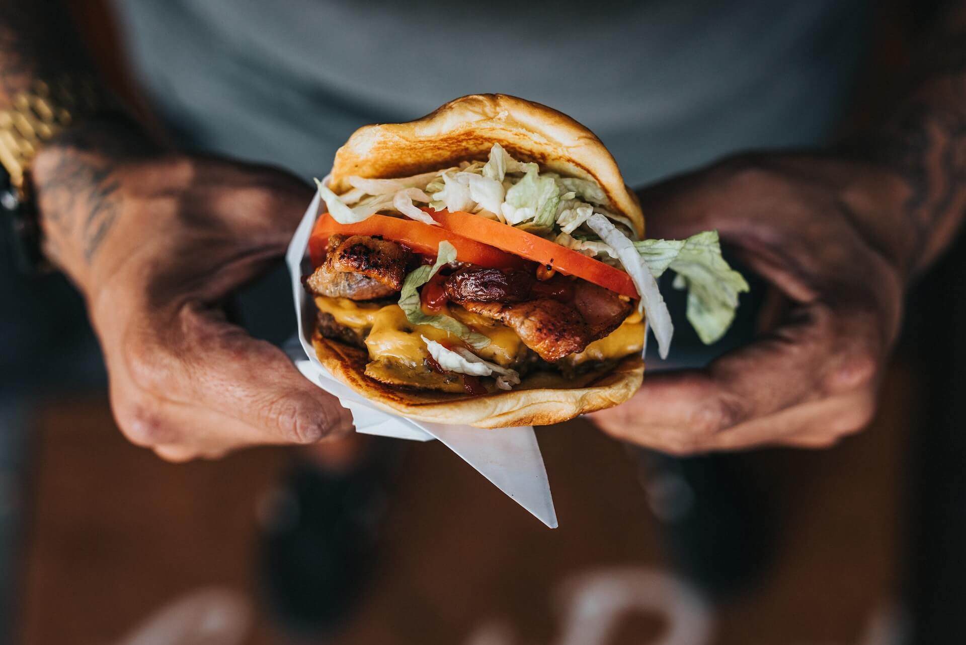
Closeup of hands holding burger

Those wondering what food and beverage menu items are performing best among consumers throughout Canada need wonder no more.

And why is that? Well, Restaurants Canada has the answers, revealing the top ten food and top ten beverage items.

Further, the organization compares each item’s performance. In this instance, Restaurants Canada analyses the percentage of orders that contained each food or beverage item from January to April 2022 in comparison to 2019.

These insights (and many more) are available in Restaurants Canada’s 2022 Foodservice Facts report. In fact, you can find our reviews of several of the restaurant advocacy group’s report topics via the links below:

For your own copy of this year’s Foodservice Facts report, click here.

Top 10 Canadian Drink Menu Trends

As you’ll see below, coffee is outperforming nearly every other beverage category. Specifically, Hot coffee is at the top, while Iced or frozen coffee is ranked third.

Unsurprisingly, Carbonated soft drinks / Pop / Soda split the two coffee categories. According to Restaurants Canada, the Carbonated soft drink category can credit its performance in large part to QSRs.

  1. Milk: 1.8% (2019) to 1.8% (2022)
  2. Iced tea: 2.9% (2019) to 1.6% (2022)
  3. Milkshakes / Smoothies: 2.1% (2019) to 2.0% (2022)
  4. Fruit juice: 3.8% (2019) to 3.0% (2022)
  5. Hot tea: 5.5% (2019) to 4.5% (2022)
  6. Alcohol beverages: 5.1% (2019) to 5.7% (2022)
  7. Water: 6.6% (2019) to 5.0% (2022)
  8. Iced or frozen coffee: 5.3% (2019) to 7.5% (2022)
  9. Carbonated soft drinks / Pop / Soda: 19.7% (2019) to 20.2% (2022)
  10. Hot coffee: 40.9% (2019) to 41.9% (2022)

Compellingly, Alcohol beverage performance in restaurants fluctuated by age group between 2021 and 2022. Alcohol order shares in restaurants, per Restaurants Canada:

  • Legal drinking Age (LDA) to 34: 46% (2021) to 43% (2022)
  • 35 to 49: 17% (2021) to 21% (2022)
  • 50-plus: 37% (2021) to 36% (2022)

Alcohol order shares in bars, according to Restaurants Canada:

  • LDA to 34: 35% (2021) to 35% (2022)
  • 35 to 49: 17% (2021) to 19% (2022)
  • 50-plus: 49% (2021) to 47% (2022)

Overall, the 35 to 49 age group appears to be consuming less alcohol in bars and restaurants in comparison to the LDA to 34 and 50-plus cohorts.

Top 10 Canadian Food Menu Trends

As Restaurants Canada notes, the Sandwich / Sub category has grown in 2022. Interestingly, the category just below it in growth, Chicken, is partially responsible for boosting Sandwich / Sub performance.

As far as entrees or “main attractions,” the Burger category remains at the top, beating out Breakfast, Sandwich / Sub, Chicken, and Pizza menu items.

  1. Cake / Squares / Muffins: 3.7% (2019) to 3.3% (2022)
  2. Salad: 4.3% (2019) to 3.8% (2022)
  3. Donuts / Beignets: 3.0% (2019) to 3.8% (2022)
  4. Breads: 4.3% (2019) to 3.4% (2022)
  5. Pizza / Panzerotti / Calzone: 4.1% (2019) to 4.3% (2022)
  6. Chicken: 7.6% (2019) to 8.5% (2022)
  7. Sandwich / Sub: 8.0% (2019) to 8.5% (2022)
  8. Breakfast: 10.8% (2019) to 11.4% (2022)
  9. Burger: 9.0% (2019) to 10.9% (2022)
  10. French fries / Potato / Sweet potato / Onion rings: 15.0% (2019) to 16.1% (2022)

Image: Nathan Dumlao on Unsplash

by David Klemt David Klemt No Comments

The Numbers on Food Delivery in Canada

The Numbers on Food Delivery in Canada

by David Klemt

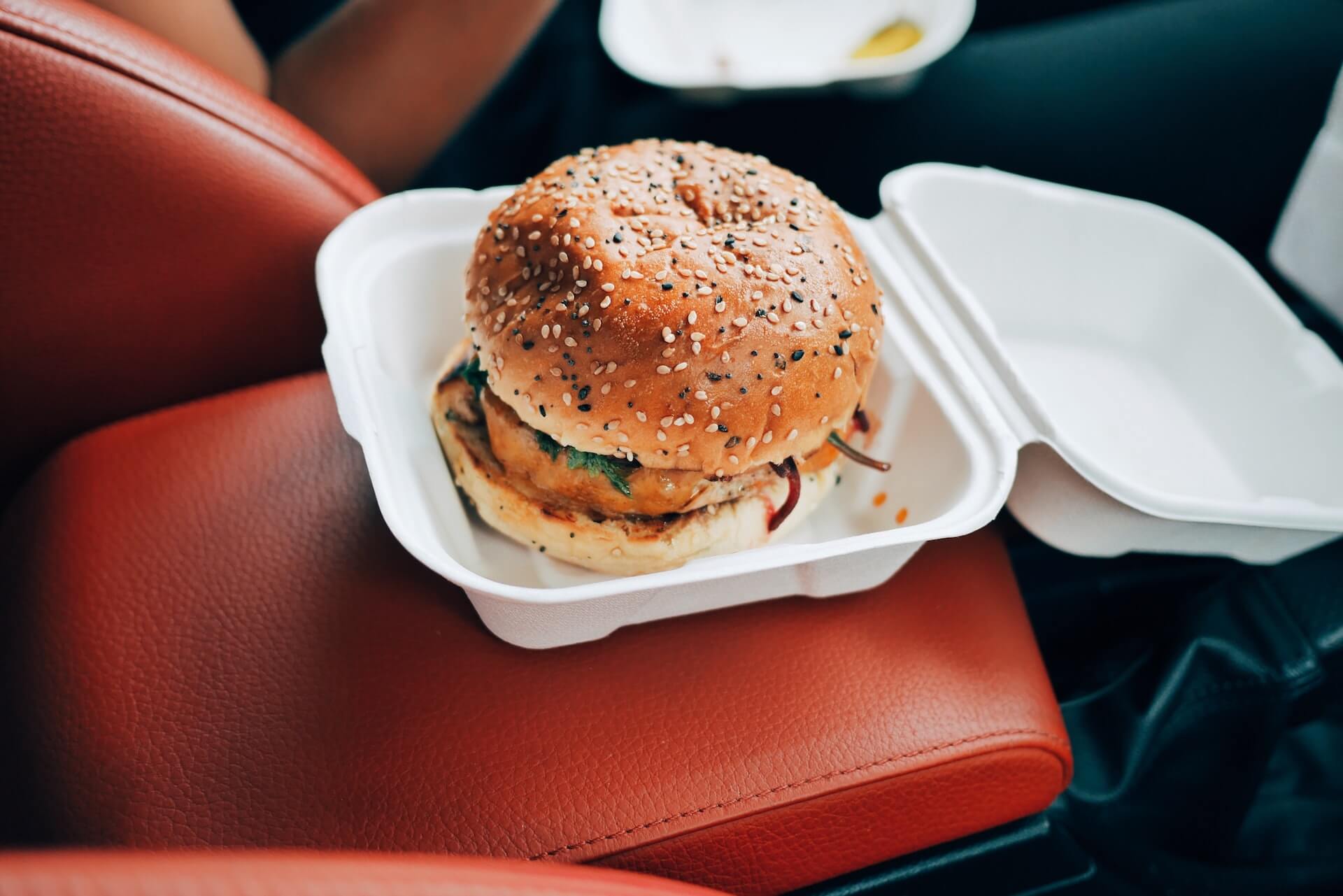
Burger in container inside car

For most restaurants, delivery is now a crucial service element rather than a “nice-to-have” option a small percentage of guests expect.

This is true whether your restaurant is in the US or Canada. But who’s placing orders? How are they ordering? And will they continue to order for the foreseeable future?

Well, Restaurants Canada has answers to all those questions and more. So, we let’s take a look at what their 2022 Foodservice Facts report says about delivery.

To download your own copy of this informative report, click here.

Who’s Placing Orders?

In their 2022 Foodservice Facts report, Restaurants Canada looks at three age groups:

  • 18 to 34
  • 35 to 54
  • 55-plus

Perhaps unsurprisingly, the 18- to 34-year-old cohort leads the charge when it comes to ordering delivery. It’s also not surprising that 35 to 54 comes in second, and 55 and older is third.

However, the first two groups are closer than some may assume. Eighty-three percent of the the 18 to 34 cohort placed orders at quick-service or full-service restaurants between December 2021 and May 2022.

That number does drop for the same time period among the 35 to 54 group, but not by a significant amount. Of that cohort, 77 percent ordered delivery. Just over half of the 55-plus group placed delivery orders: 52 percent.

Now, those numbers are down a bit from 2021, which makes sense. Things were much more restrictive in 2021 and people were just getting back to a sense of normalcy at the start of this year.

In 2021, the delivery order percentages were:

  • 18 to 34: 89 percent
  • 35 to 54: 81 percent
  • 55-plus: 67 percent

Looking at these numbers, it appears the 55-plus cohort is more comfortable dining out in person. Conversely, the 18 to 34 age group is clearly comfortable making delivery a part of their everyday lives.

How do People Want to Order?

Believe it or not, your website still matters. I’ve been saying this for years but the pervasiveness of delivery and takeout ordering is really driving this point home.

The fact is, a notable percentage of your guests want to support your restaurant and staff directly. Over the past couple of years, consumers have become well aware that third-party delivery services are incredibly costly for operators.

Consumers are also aware of third-party delivery debacles, such as the abysmal Grubhub “Free Lunch” mess from May of this year.

So, direct delivery is something that operators need to at least consider. Implementation is often less difficult than most business owners believe. And many platforms, SevenRooms, for example, make implementing direct delivery simple and affordable.

Interestingly, Restaurants Canada data supports the need for direct delivery. Back in May, the industry advocacy organization asked survey respondents how they prefer to place delivery orders from restaurants.

Preferences for QSR customers:

  • No preference: 10 percent
  • Over the phone: 19 percent
  • Third party: 35 percent
  • Restaurant website or app: 36 percent

Full-service customer preferences:

  • No preference: 8 percent
  • Over the phone: 28 percent
  • Third party: 29 percent
  • Restaurant website or app: 35 percent

Honestly, I find it surprising anyone calls a QSR to place an order. However, I suppose that makes sense for an office or catering.

At any rate, make sure your website is up-to-date, you offer direct or “last-mile” delivery, and make it easy to navigate your menu and the ordering process.

Is Ordering Here to Stay?

Now, we all know why restaurant delivery has been supercharged the past two years. However, consumer trend data show that delivery was on the rise before the Covid-19 pandemic.

But now that people are eager to return to normal and the industry is on its way to returning to pre-pandemic levels, is delivery really here to stay?

According to another question asked of survey respondents by Restaurants Canada, more than half of QSR and full-service restaurant customers plan to stick with delivery.

For their 2022 Foodservice Facts report, Restaurants Canada asked back in May how often consumers planned to place delivery orders in the next six months.

Order frequency for QSR customers:

  • Never placed a delivery order and don’t plan to now: 29 percent
  • Order less often: 20 percent
  • Will order with the same frequency: 45 percent
  • Will order more often: 7 percent

Frequency of orders for full-service customers:

  • Never placed a delivery order: 24 percent
  • Order less often: 23 percent
  • Will order with the same frequency: 44 percent
  • Will order more often: 9 percent

Here to Stay?

Of course, there are multiple factors feeding the numbers above. Some people simply don’t like ordering and waiting for delivery. For these consumers, the practice doesn’t just seem convenient.

There’s also the consumer demand to return to in-person dining, socializing with family and friends. And, of course, meeting new people while dining out.

We must also consider inflation and rising costs. Often, restaurant spending is among the first to be reduced when consumers need to be more frugal. Rising menu costs are sure to curtail some delivery spending.

That said, it’s clear delivery is here to stay and must be considered a crucial element for most restaurant operations. QSR and full-service operators need to bear in mind is placing orders; how often they’re placing orders; and get them in the habit of placing orders directly.

Image: Oliur on Unsplash

by David Klemt David Klemt No Comments

Operators & Guests Respond to Rising Costs

Operators & Guests Respond to Rising Costs

by David Klemt

Canadian dollar bills

Everything is more expensive these days and both operators and consumers have their own ideas for addressing rising costs.

To gather and share insight into people’s mindsets, Restaurants Canada conducted and commissioned two surveys.

For one, the industry research and advocacy organization surveyed operators. The focus was on how much operators anticipated increasing their prices.

On the other side, Restaurants Canada commissioned Angus Reid for a survey focusing on consumers. This survey revealed potential traffic slowdowns and perceived value for money.

For your own copy of Restaurant Canada’s 2022 Foodservice Facts report, click here.

QSR vs. FSR: Consumers

As an operator, converting first-time visitors into repeat guests is paramount. Equally as important: increasing visit frequency per guest.

Of course, an immediate byproduct of rising costs is consumers pulling back and reevaluating their spending. Oftentimes, dining out is one of the first costs consumers slash in order to save money.

Therefore, operators always face the risk of reduced traffic and even losing some guests permanently when they raise prices. However, this is often a necessary risk to take to combat rising costs.

So, how dire is the situation among Canadian consumers currently? Or at least, how did they feel in Q2 of this year? Angus Reid conducted a survey of consumers to find out, and the results can be found within the 2022 Foodservice Facts report.

First, let’s look at visit frequency for QSRs and FSRs. Before we begin, 12 percent of survey respondents answer that they “don’t know for sure” if rising prices will affect their visit frequency for either QSRs or FSRs. Not helpful.

For QSRs, 19 percent of respondents say an increase in prices won’t impact their visit frequency. Thirty-six percent anticipate visiting “a little less often,” while 32 percent will visit much frequently.

As for FSRs, 16 percent of survey respondents won’t change their visit frequency. However, 37 percent anticipate visiting FSRs much less often. Nearly as many, 36 percent, will visit a bit less frequently.

Interestingly, however, is perceived value. More FSR guests believe they receive excellent or good value for their money than they do from QSRs. More QSR guests believe they receive fair, poor, or very poor value for their money.

Overall, though, 90 percent of Canadian consumers feel positive toward the value they receive from QSRs and FSRs.

QSR vs. FSR: Operators

Clearly, it’s good news that the vast majority of Canadians believe they receive good value for their money when dining out.

Nobody enjoys paying more but it appears that both QSRs and FSRs in Canada can increase their prices. At least, they can do so for now while consumers are mostly understanding about inflation.

Restaurants Canada asked QSR and FSR operators a simple but revealing question for their 2022 Foodservice Facts report. The question? How much higher do operators expect to increase their prices by the end of Q4 of this year in comparison to last year?

The majority of operators in both categories anticipate they’ll increase menu prices by more than seven percent. Twenty-seven percent of QSR operators have that expectation. That number rises to 35 percent for FSR operators.

Twenty-two percent of QSR operators anticipate raising prices five to seven percent before the end of 2022. In comparison, 32 percent of FSR operators expect to raise prices in the same range.

At the moment, Canadian consumers appear to be willing to endure these increases. However, it’s likely they expect prices to drop back to “normal” (pre-pandemic prices) or close to it sometime in 2023. That is, unless Canada slides into recession.

Image: PiggyBank on Unsplash

Top